Straight Up Health
Straight Up Health
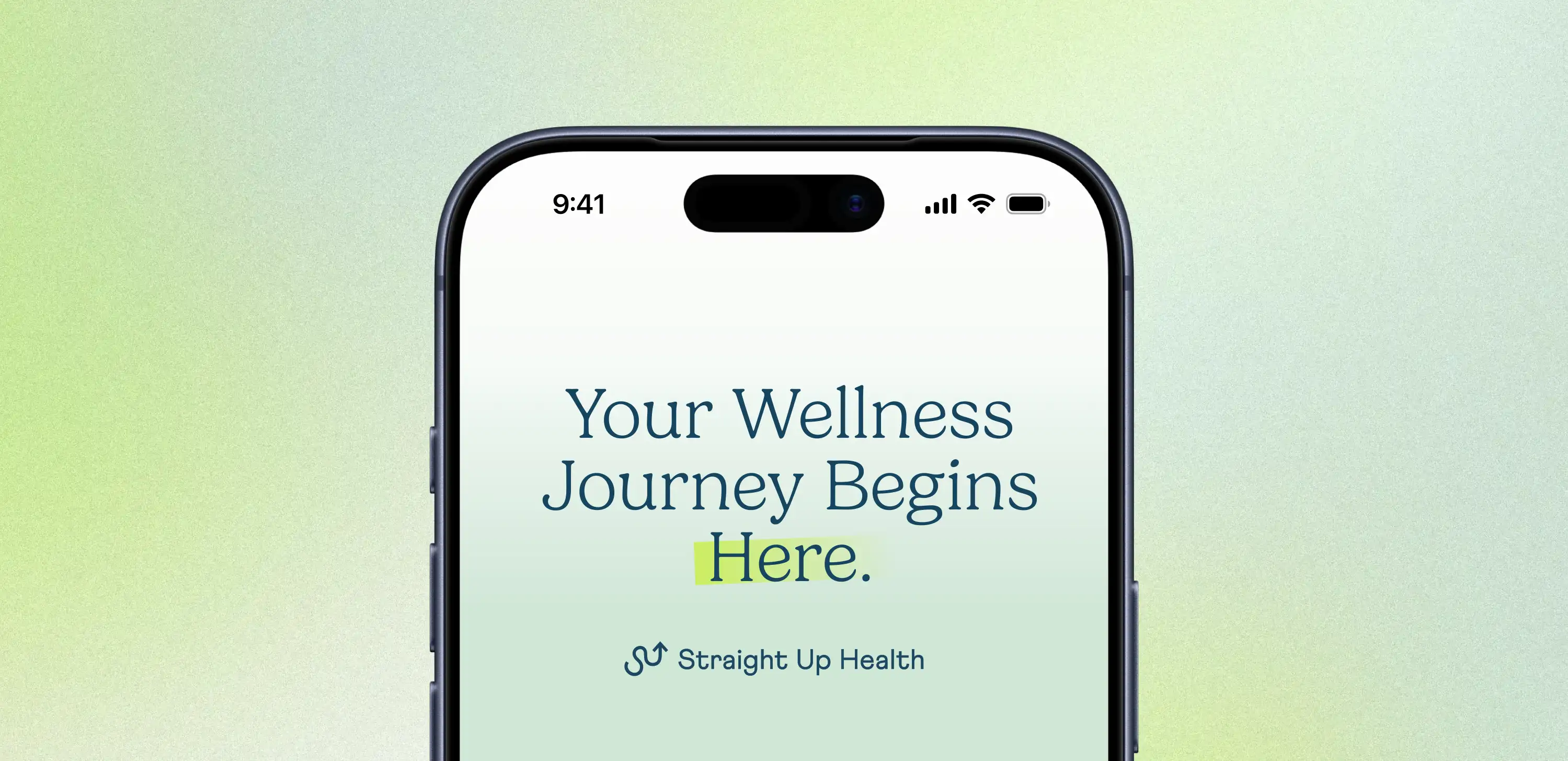
An approachable identity for youth mental healthcare.
Straight Up Health is a youth-focused health and wellness organization delivering educational resources and programming for schools and communities. They brought me in to refresh their digital presence through website design, brand development, and supporting marketing materials.
Straight Up Health is a youth-focused health and wellness organization delivering educational resources and programming for schools and communities. They brought me in to refresh their digital presence through website design, brand development, and supporting marketing materials.
The existing website and marketing materials lacked consistency and did not fully reflect the organization’s approachable, youth-focused mission. The goal was to create a more engaging and accessible visual experience that could better connect with younger audiences while maintaining credibility within healthcare and educational spaces. As a freelance designer, I supported the refresh through website design, brand development, social content, and supporting marketing materials.
Year
Tag Here
Tools
Squarespace
Illustrator
Figma
Read More
Branding
Digital & Web
Healthcare
Services Provided:
Brand Refresh
Brand Refresh
Website Development
Website Development
Marketing Collateral
Marketing Collateral
Brand Strategy
Brand Strategy
Visual Identity
Visual Identity


How it was solved
The site needed a better structure, and the brand needed more visual range. The client had a clear vision for where the organization was heading, and the work was about translating that into a site that guided people properly with a visual system that had enough depth to support it.
The site needed a better structure, and the brand needed more visual range. The client had a clear vision for where the organization was heading, and the work was about translating that into a site that guided people properly with a visual system that had enough depth to support it.
Brand Identity
A review of existing brand materials revealed opportunities to tighten the visual language across the brand. The identity was expanded through updated typography, an extended colour palette, and additional supporting brand elements that brought greater consistency to the overall system.
A review of existing brand materials revealed opportunities to tighten the visual language across the brand. The identity was expanded through updated typography, an extended colour palette, and additional supporting brand elements that brought greater consistency to the overall system.
Web Design
The website was redesigned with a stronger focus on usability, mobile responsiveness, and simplified navigation. Updated layouts improved clarity and created a more engaging experience across devices.
The website was redesigned with a stronger focus on usability, mobile responsiveness, and simplified navigation. Updated layouts improved clarity and created a more engaging experience across devices.
Marketing
From social graphics and digital ads to one-pagers and business development materials, the work spanned schools, healthcare networks, and corporate communications. The result was a consistent visual voice that could flex across a wide range of audiences.
From social graphics and digital ads to one-pagers and business development materials, the work spanned schools, healthcare networks, and corporate communications. The result was a consistent visual voice that could flex across a wide range of audiences.


The Outcome
The refreshed brand gave Straight Up Health an approachable presence for a younger audience and a credible one for those working alongside them in healthcare and education. Expanding the visual system also laid the groundwork for future content, making it easier to build new materials quickly and with confidence.
The refreshed brand gave Straight Up Health an approachable presence for a younger audience and a credible one for those working alongside them in healthcare and education. Expanding the visual system also laid the groundwork for future content, making it easier to build new materials quickly and with confidence.


