Burlington Symphony Orchestra
Burlington Symphony Orchestra
Making live symphonic music easier to discover.
Making live symphonic music easier to discover.
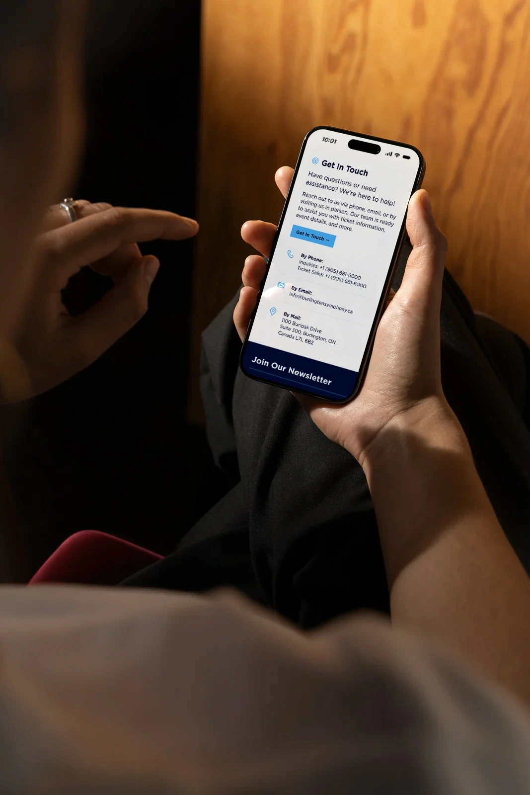
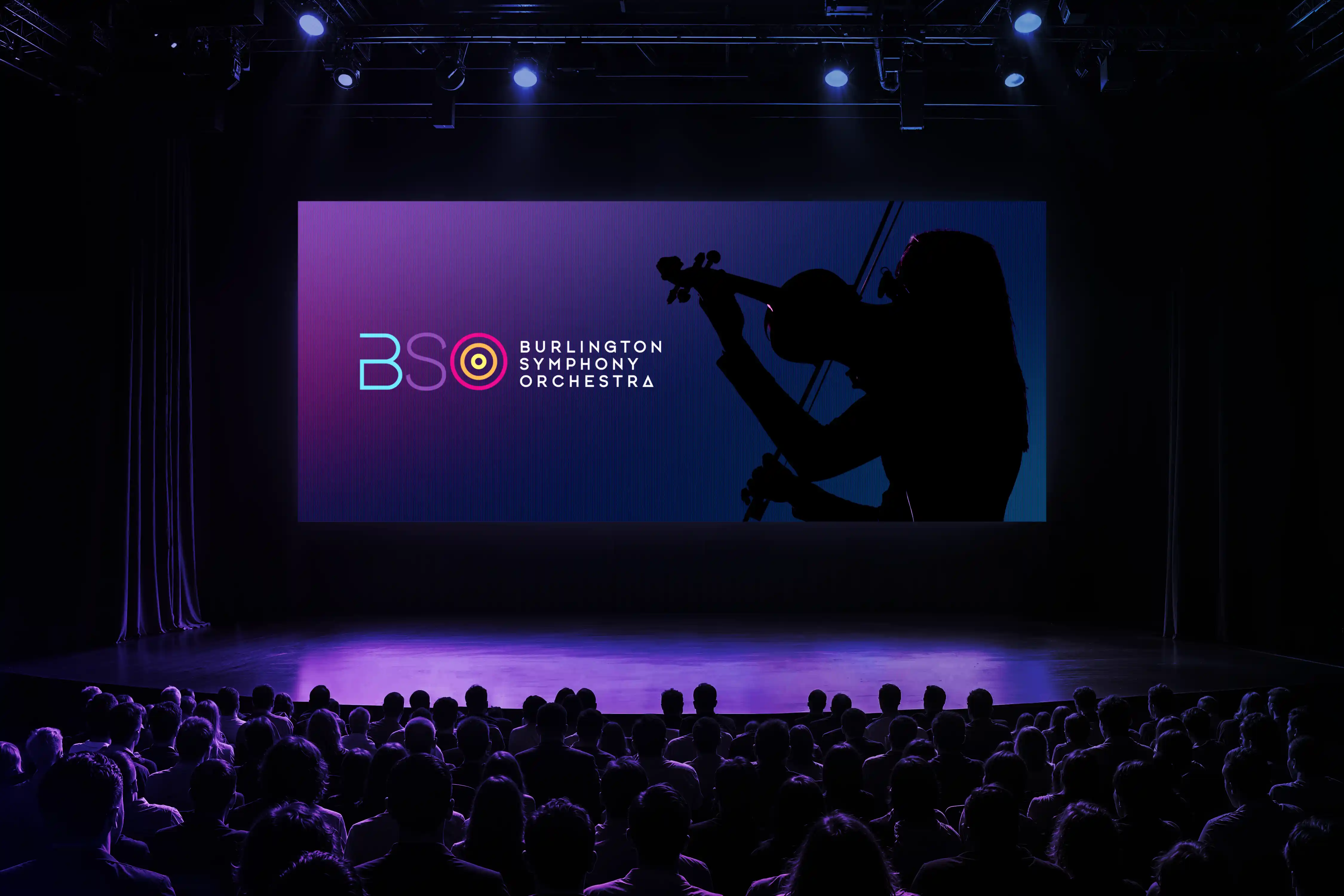
The Burlington Symphony Orchestra had a website full of information but no clear way to navigate it. In an ongoing volunteer role, I redesigned and rebuilt its WordPress site around usability, bringing order to scattered content and giving visitors a direct route to the next performance. Designed with older patrons in mind, the new experience pairs straightforward navigation with a polished visual presence. A flowing thread carries the idea that live symphonic moments connect us all. It moves through the site as a visual motif, connecting pages and guiding visitors from one part of the experience to the next. Beyond the website, it extends into the orchestra’s wider creative work, giving the season a recognizable visual language and a sense of continuity.
The Burlington Symphony Orchestra had a website full of information but no clear way to navigate it. In an ongoing volunteer role, I redesigned and rebuilt its WordPress site around usability, bringing order to scattered content and giving visitors a direct route to the next performance. Designed with older patrons in mind, the new experience pairs straightforward navigation with a polished visual presence. A flowing thread carries the idea that live symphonic moments connect us all. It moves through the site as a visual motif, connecting pages and guiding visitors from one part of the experience to the next. Beyond the website, it extends into the orchestra’s wider creative work, giving the season a recognizable visual language and a sense of continuity.
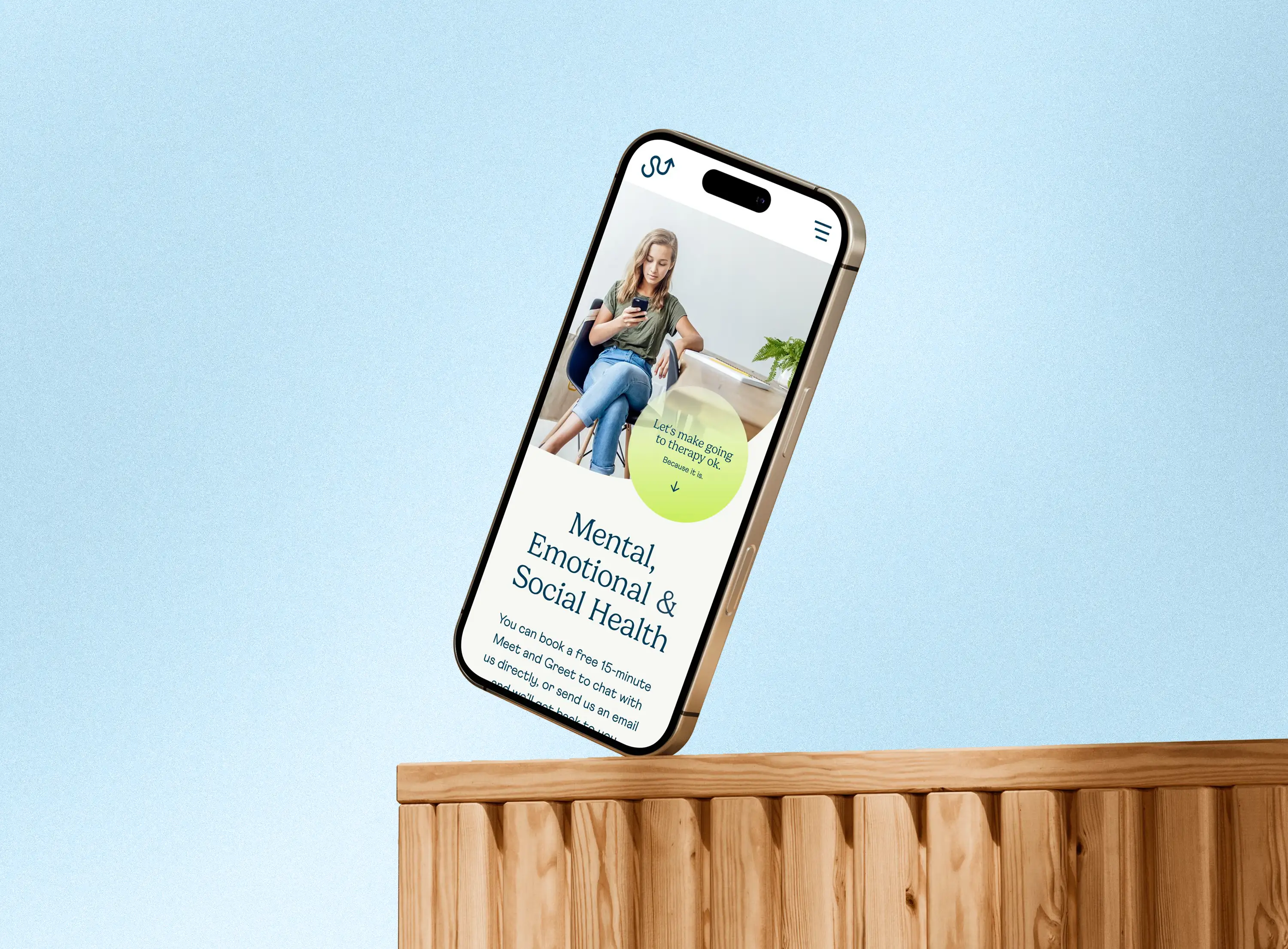
The existing website and marketing materials lacked consistency and did not fully reflect the organization’s approachable, youth-focused mission. The goal was to create a more engaging and accessible visual experience that could better connect with younger audiences while maintaining credibility within healthcare and educational spaces. As a freelance designer, I supported the refresh through website design, brand development, social content, and supporting marketing materials.
Year:
Tag Here
Tools:
Figma
WordPress
Photoshop
Read More
The existing website and marketing materials lacked consistency and did not fully reflect the organization’s approachable, youth-focused mission. The goal was to create a more engaging and accessible visual experience that could better connect with younger audiences while maintaining credibility within healthcare and educational spaces. As a freelance designer, I supported the refresh through website design, brand development, social content, and supporting marketing materials.
Year:
Tag Here
Tools:
Figma
WordPress
Photoshop
Read More
Digital & Web
Branding
Art, Music & Culture
Services Provided:
Website Development
Brand Strategy
Marketing Collateral
Brand Refresh
Visual Identity

How it was solved
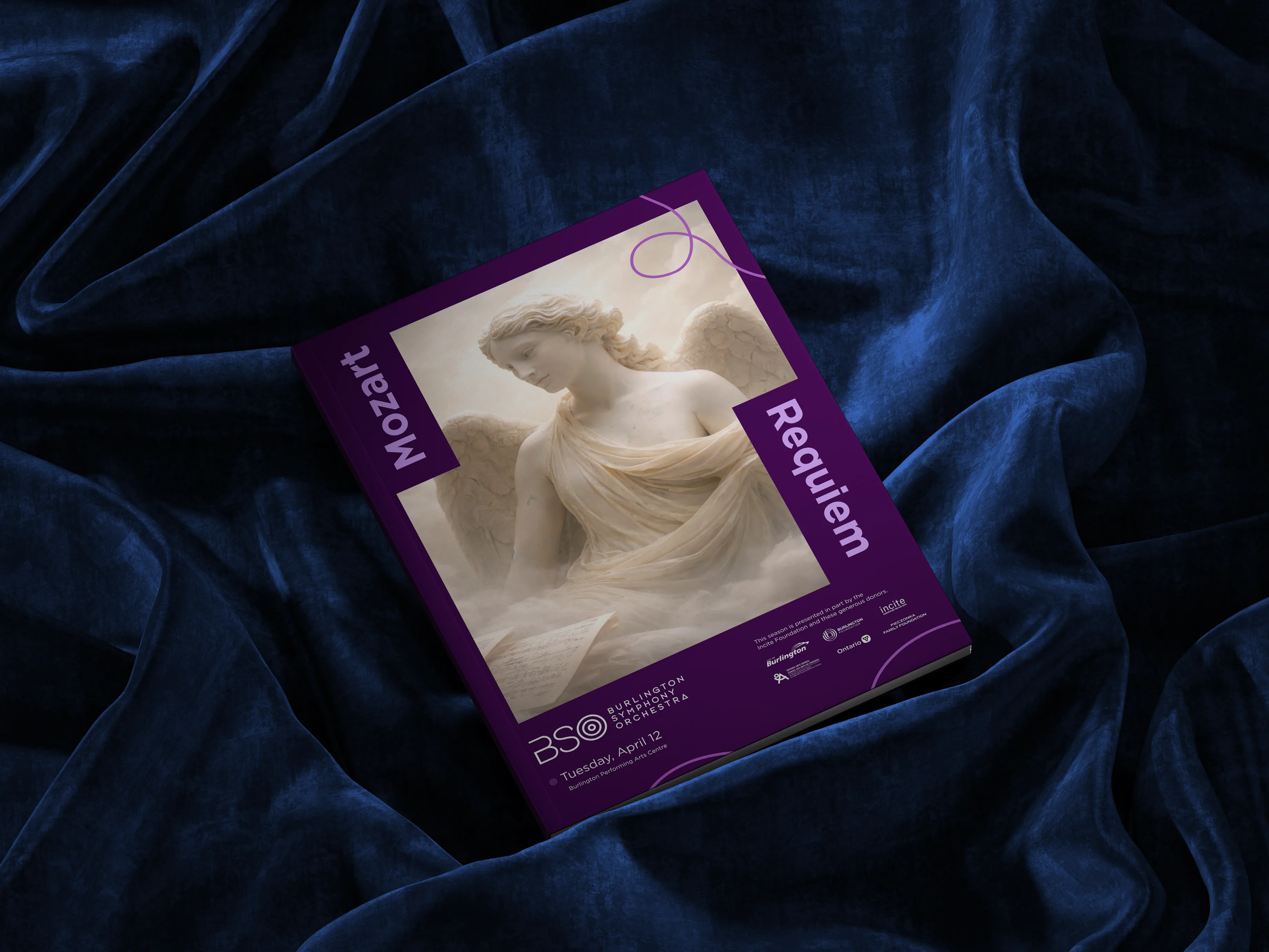
An orchestra depends on many individual parts moving as one. I used that same idea to build a creative system that could connect the website, concert programs, and promotional work without making every piece look identical. A continuous thread held the work together, while colour gave the system structure and each performance room to set its own tone.
An orchestra depends on many individual parts moving as one. I used that same idea to build a creative system that could connect the website, concert programs, and promotional work without making every piece look identical. A continuous thread held the work together, while colour gave the system structure and each performance room to set its own tone.
Web Design
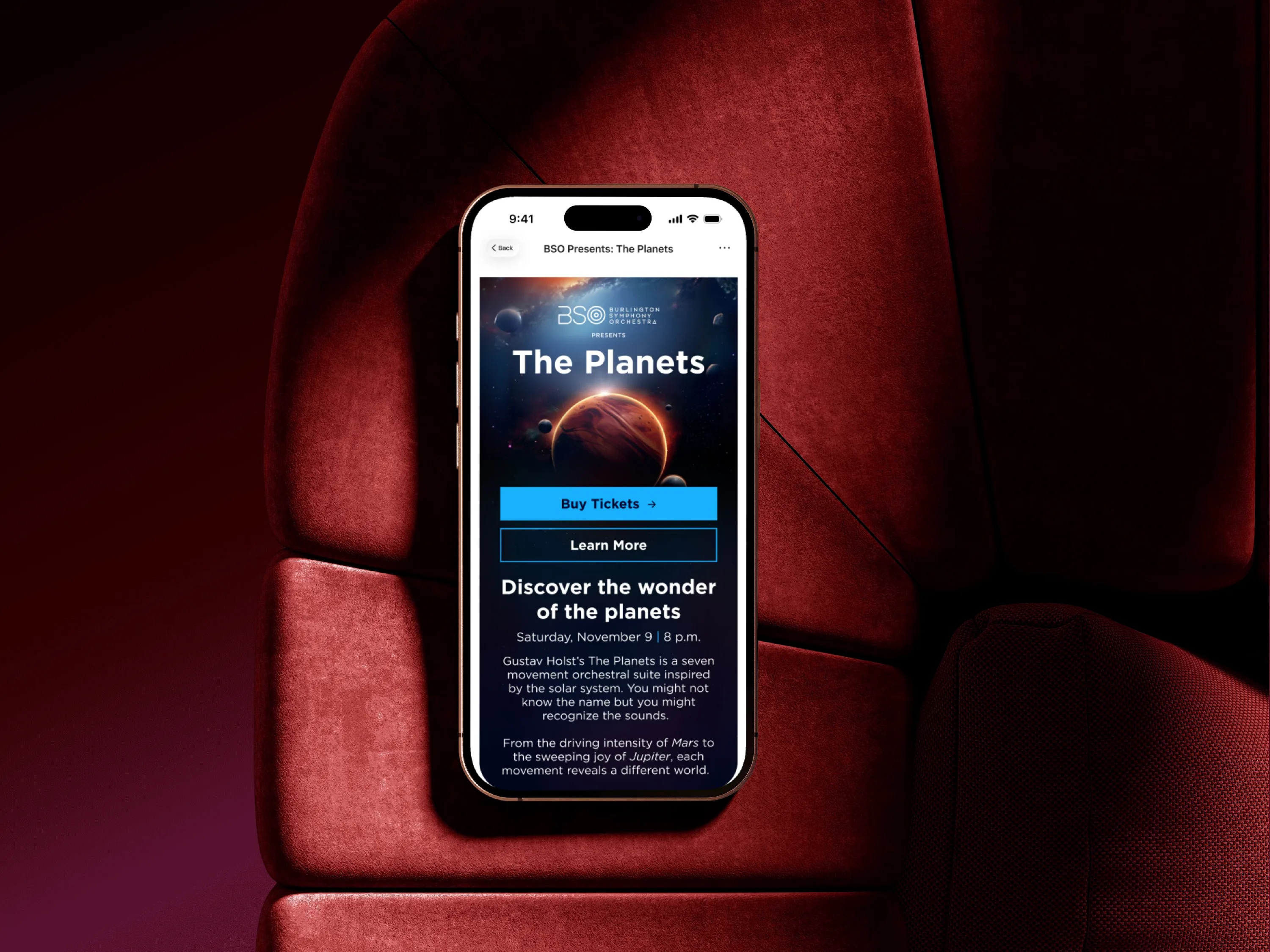
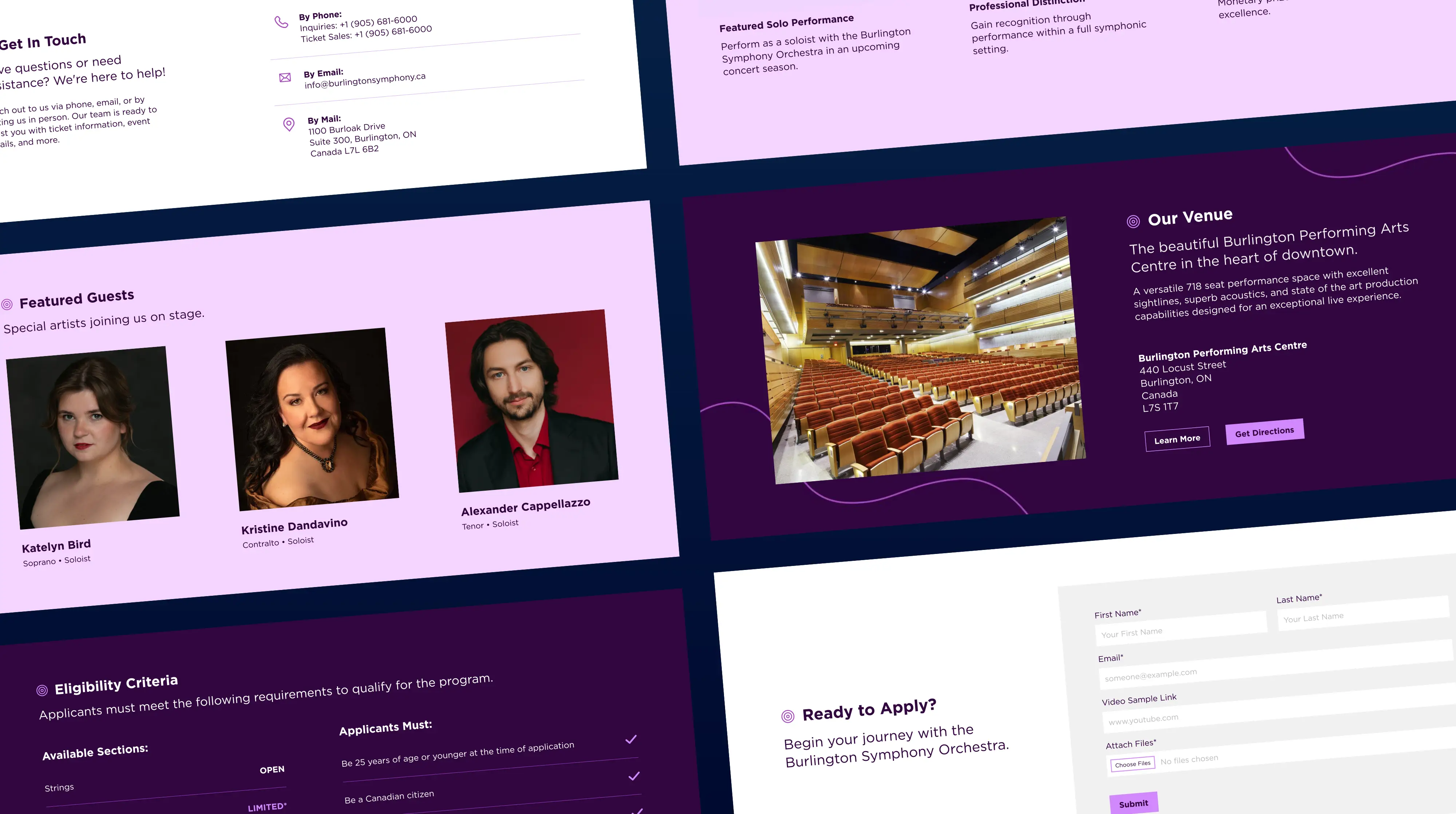
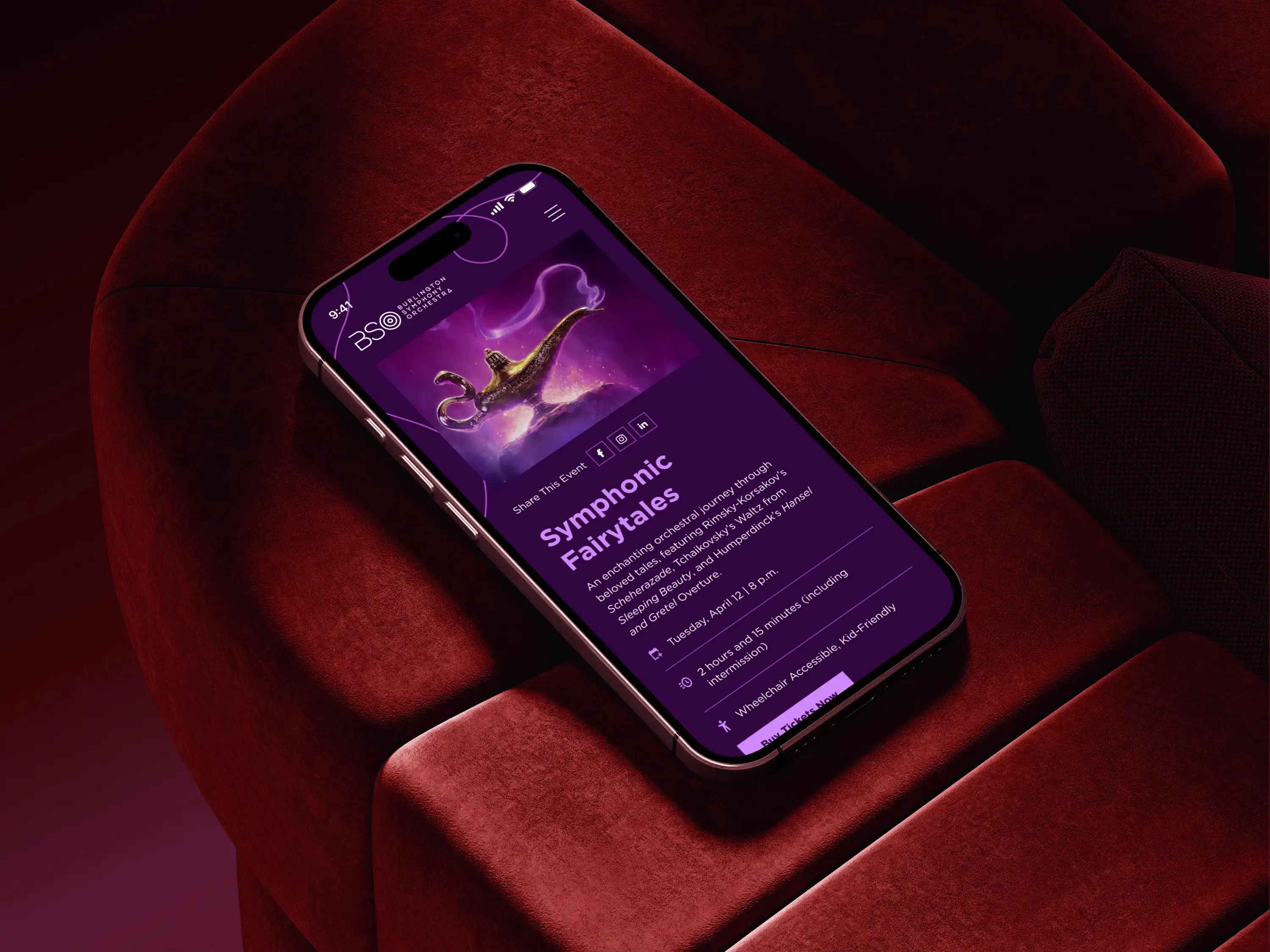
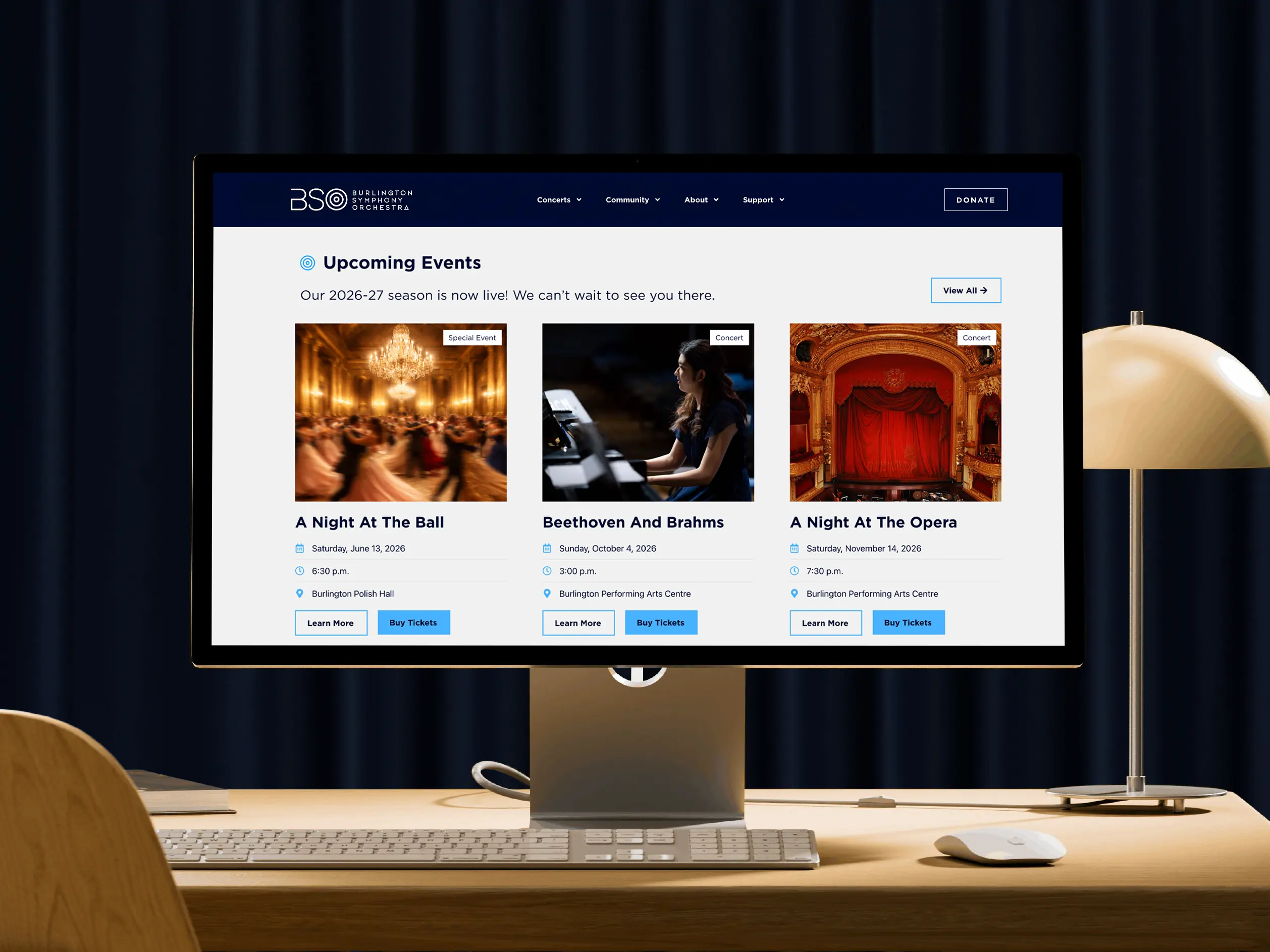
I reorganized years of collected content around what patrons needed to find first. Straightforward navigation and repeatable event pages brought ticket information and practical details closer to the surface, with an older audience in mind. Blue grounds pages about the organization, while purple signals events and programs, giving visitors a subtle sense of place as they move through the site.
I reorganized years of collected content around what patrons needed to find first. Straightforward navigation and repeatable event pages brought ticket information and practical details closer to the surface, with an older audience in mind. Blue grounds pages about the organization, while purple signals events and programs, giving visitors a subtle sense of place as they move through the site.
Visual System
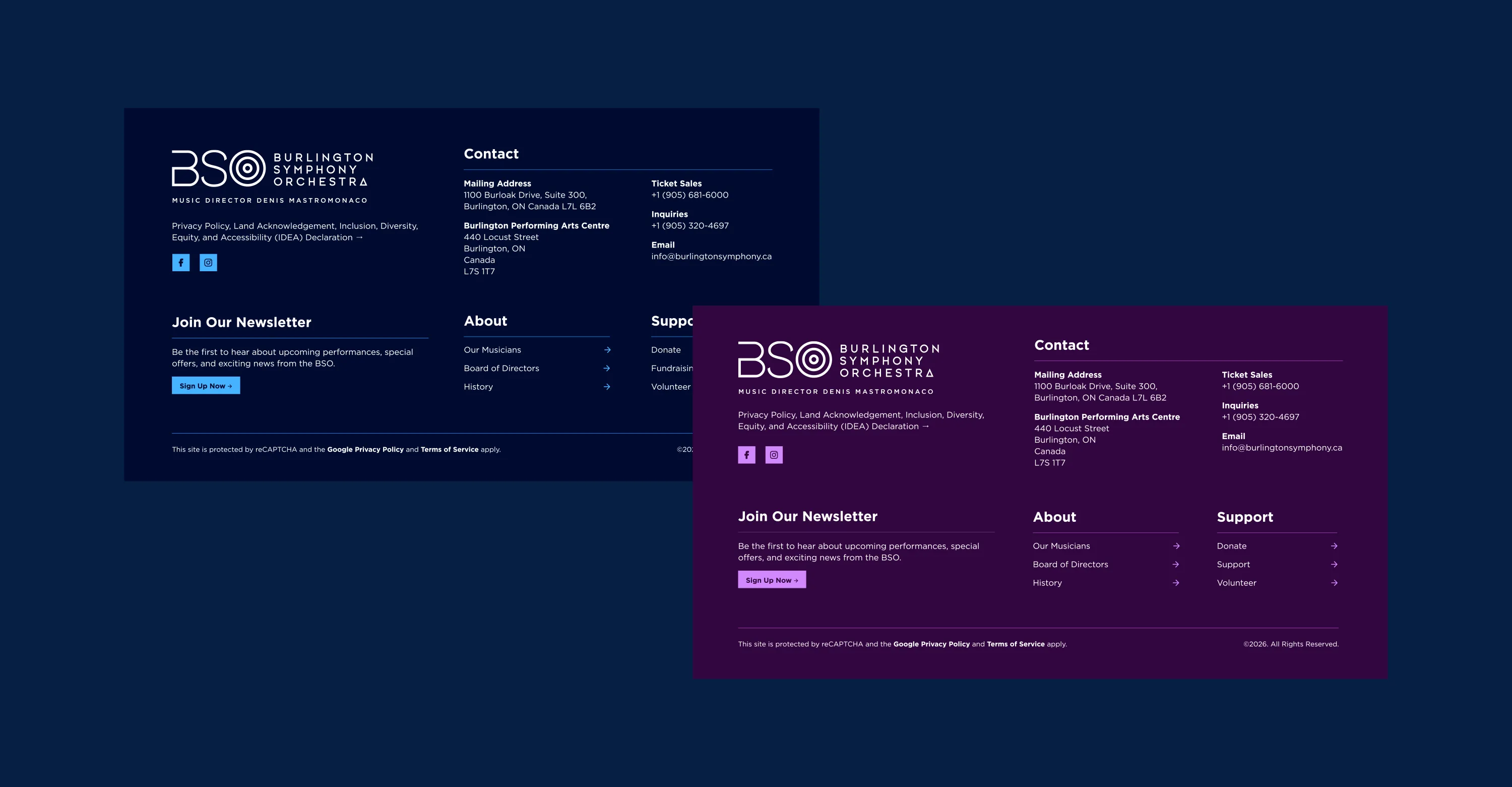
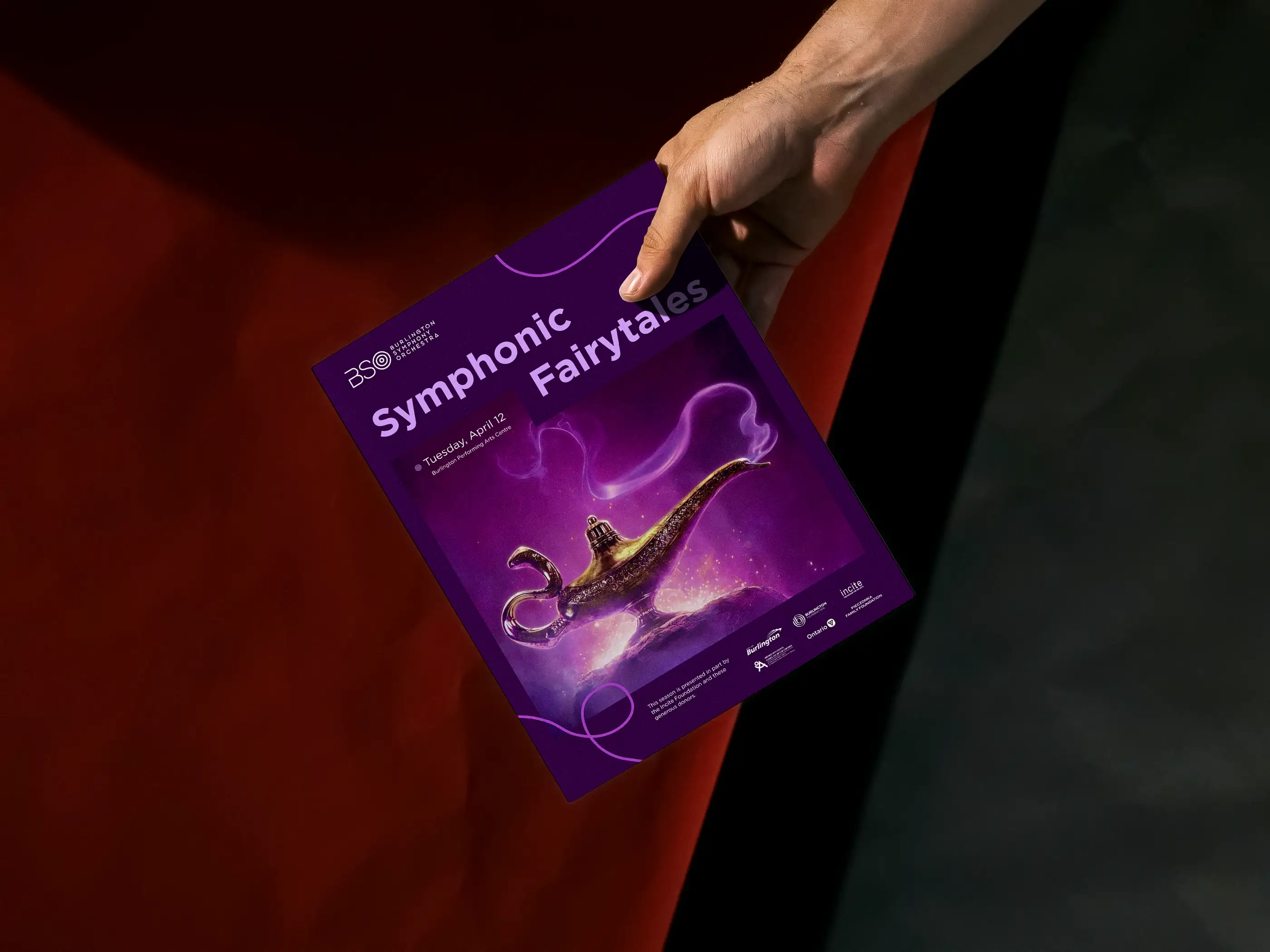
The thread takes its cue from the conductor’s movement and the connection that turns individual musicians into one orchestra. It loops through photography, follows gestures, and carries the eye across each layout. The custom O from the logo became a second recurring cue, replacing standard bullets across the website and programs so even practical information felt part of the identity.
The thread takes its cue from the conductor’s movement and the connection that turns individual musicians into one orchestra. It loops through photography, follows gestures, and carries the eye across each layout. The custom O from the logo became a second recurring cue, replacing standard bullets across the website and programs so even practical information felt part of the identity.
Event Creative
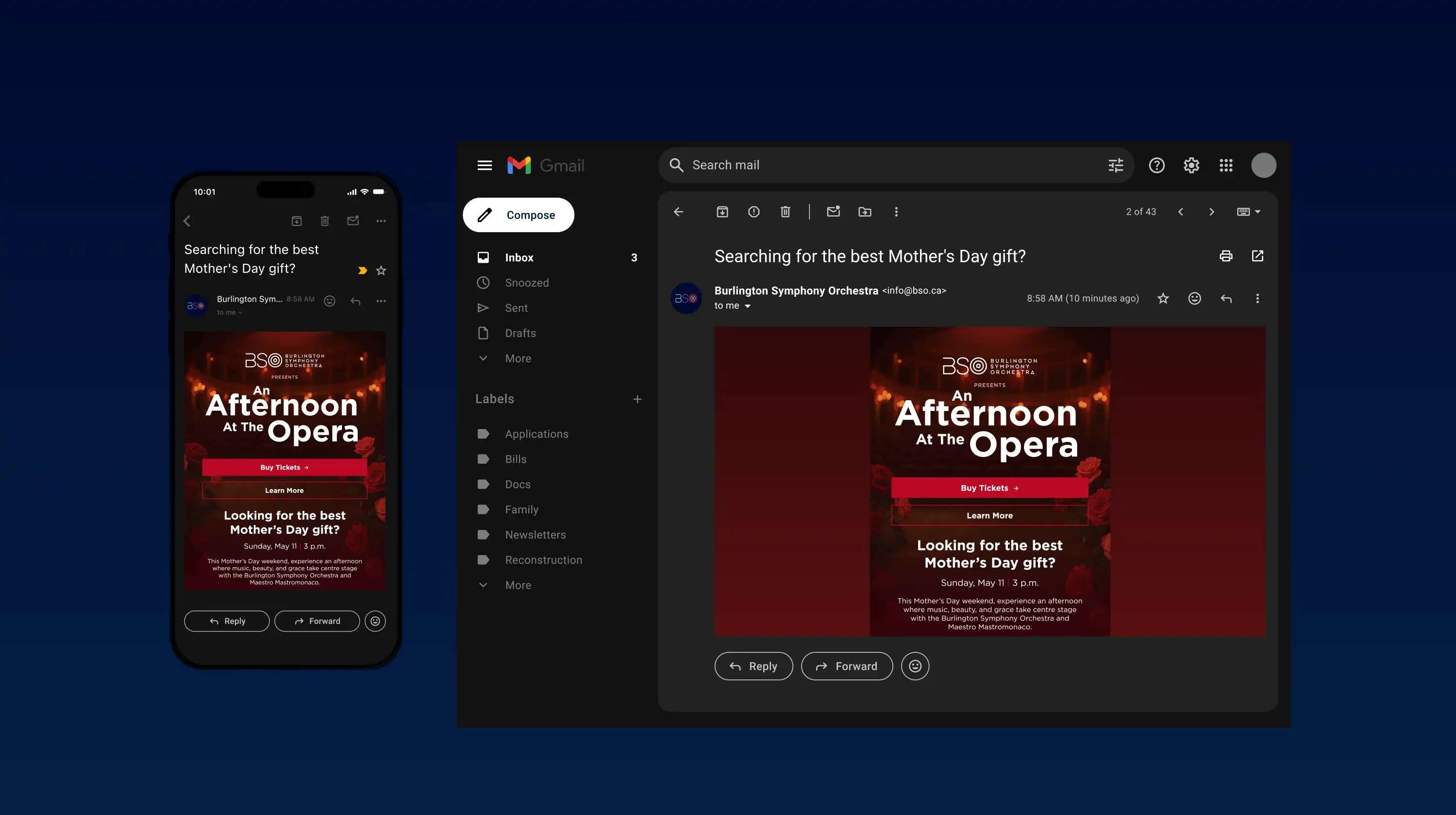
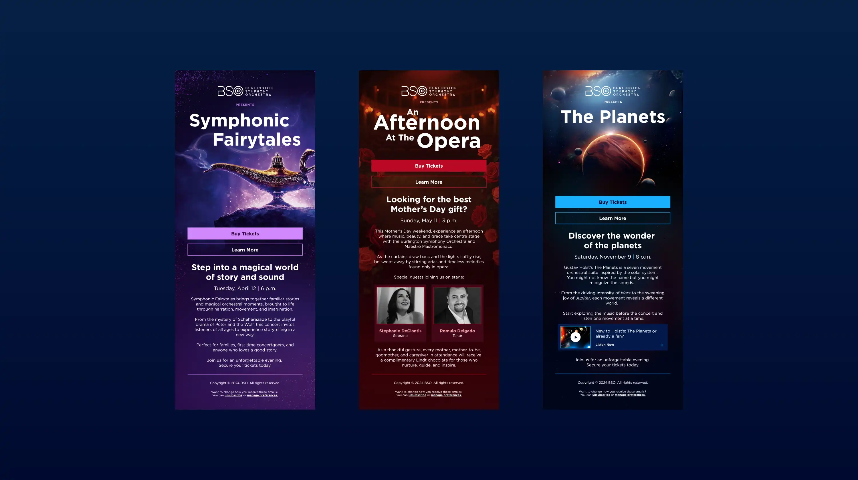
Each event needed its own atmosphere. For programs and promotional emails, I used the full palette rather than assigning one fixed colour to the season. Each piece took its lead from the event imagery, moving between purple, red, and blue as the mood changed. A consistent type hierarchy and the recurring thread kept the work recognizably BSO from one performance to the next.
Each event needed its own atmosphere. For programs and promotional emails, I used the full palette rather than assigning one fixed colour to the season. Each piece took its lead from the event imagery, moving between purple, red, and blue as the mood changed. A consistent type hierarchy and the recurring thread kept the work recognizably BSO from one performance to the next.
The Outcome
The updated digital presence gave the Burlington Symphony Orchestra a more user-friendly experience that better reflected the quality of what they put on stage. Clearer structure and more consistent promotional materials made it easier to communicate with audiences, sponsors, and the broader community across every concert and campaign.
The updated digital presence gave the Burlington Symphony Orchestra a more user-friendly experience that better reflected the quality of what they put on stage. Clearer structure and more consistent promotional materials made it easier to communicate with audiences, sponsors, and the broader community across every concert and campaign.