Million Reasons Run
Million Reasons Run
Giving a national fundraising run the identity it needs to set the pace.
Million Reasons Run is a national fundraising challenge supporting children's hospital foundations across Canada through a month-long virtual running event. My role was to develop the campaign's visual direction through illustration, social content, participant assets, website graphics, emails, merchandise, printed materials, and large-scale advertising.
Million Reasons Run is a national fundraising challenge supporting children's hospital foundations across Canada through a month-long virtual running event. My role was to develop the campaign's visual direction through illustration, social content, participant assets, website graphics, emails, merchandise, printed materials, and large-scale advertising.
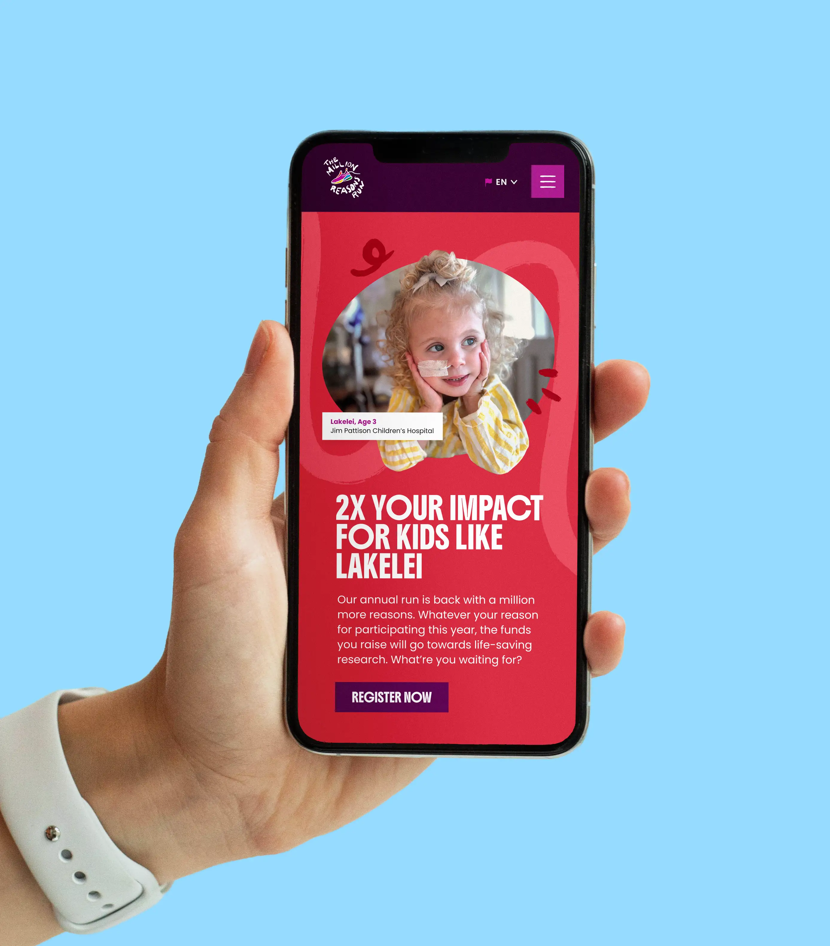
The existing website and marketing materials lacked consistency and did not fully reflect the organization’s approachable, youth-focused mission. The goal was to create a more engaging and accessible visual experience that could better connect with younger audiences while maintaining credibility within healthcare and educational spaces. As a freelance designer, I supported the refresh through website design, brand development, social content, and supporting marketing materials.
Year
Tag Here
Tools
Figma
Illustrator
Photoshop
Read More
Illustration
Digital & Web
Event
Services Provided:
Visual Identity
Visual Identity
Brand Strategy
Brand Strategy
Research & Discovery
Research & Discovery
Illustration
Illustration
Marketing Collateral
Marketing Collateral
Brand Refresh
Brand Refresh
How it was solved
The starting point was making sure the campaign had its own distinct identity, one that could stand alongside any participating foundation without appearing to favour one over another. From there, the creative built on what the event had already established, pushing it in a more energetic, fun direction while keeping enough familiarity to feel recognizable.
The starting point was making sure the campaign had its own distinct identity, one that could stand alongside any participating foundation without appearing to favour one over another. From there, the creative built on what the event had already established, pushing it in a more energetic, fun direction while keeping enough familiarity to feel recognizable.
Digital Assets
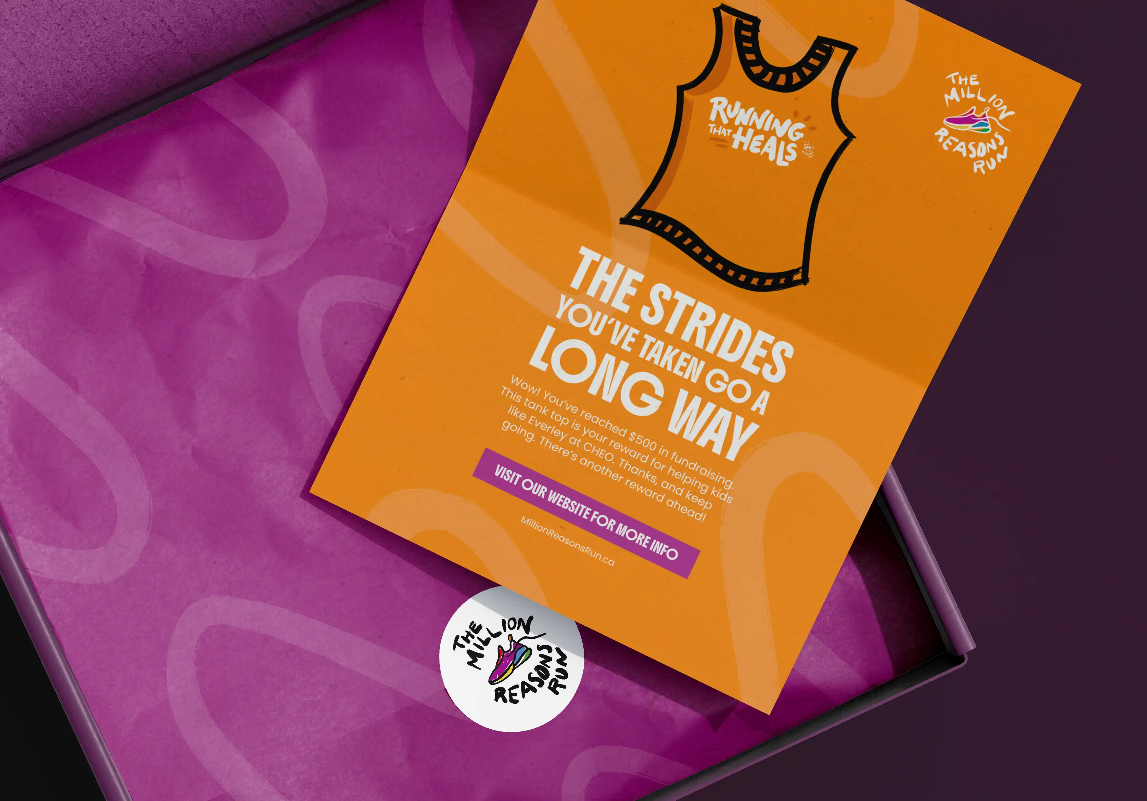
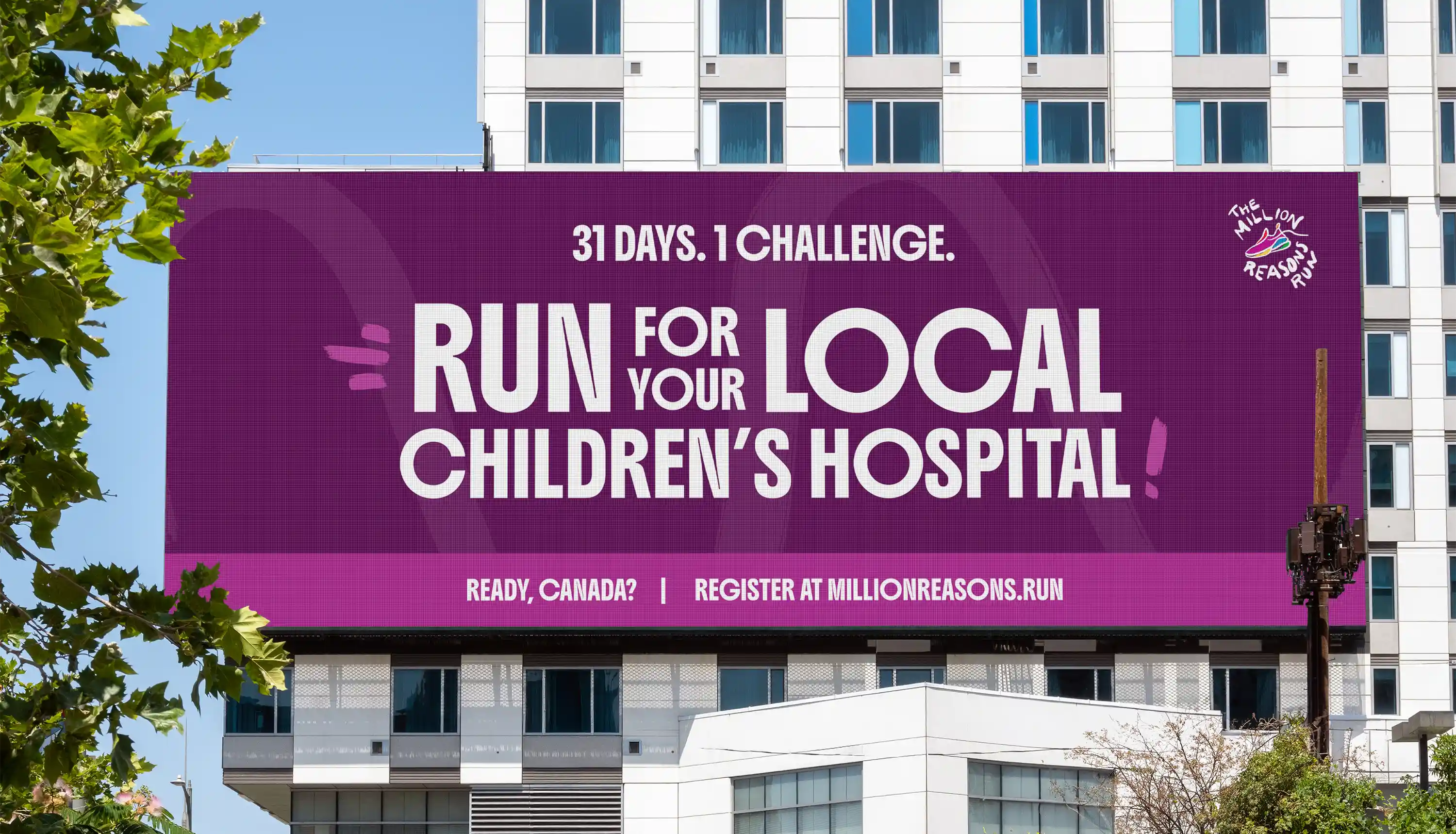
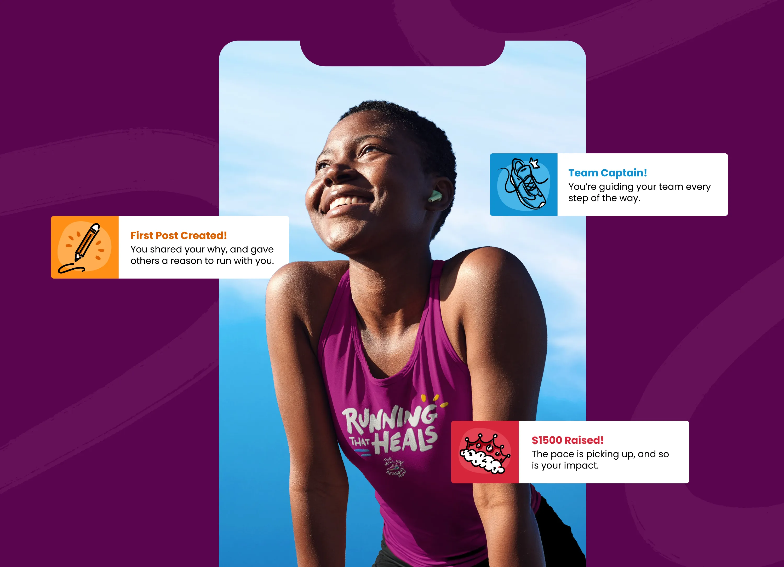
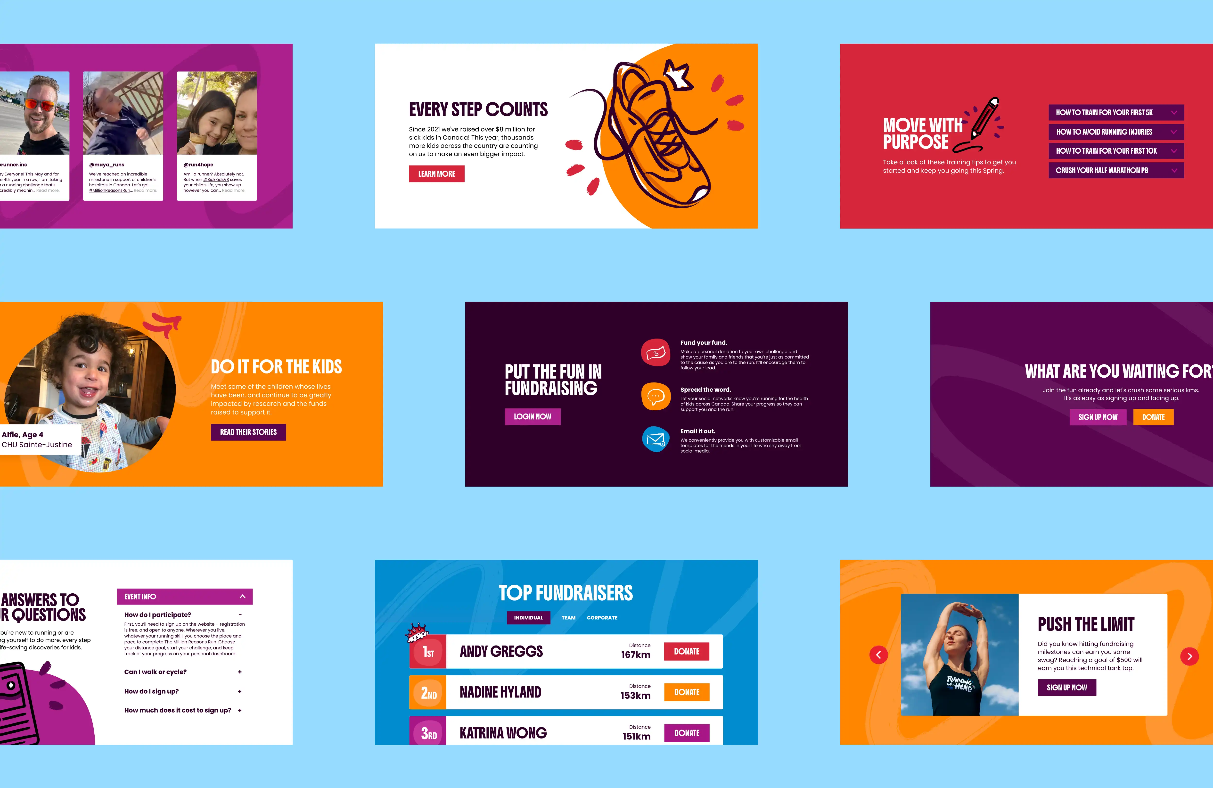
Social ads, achievement badges, email graphics, and website panels were designed to feel motivating and shareable. Each piece was built to carry the campaign energy across platforms without losing consistency.
Social ads, achievement badges, email graphics, and website panels were designed to feel motivating and shareable. Each piece was built to carry the campaign energy across platforms without losing consistency.
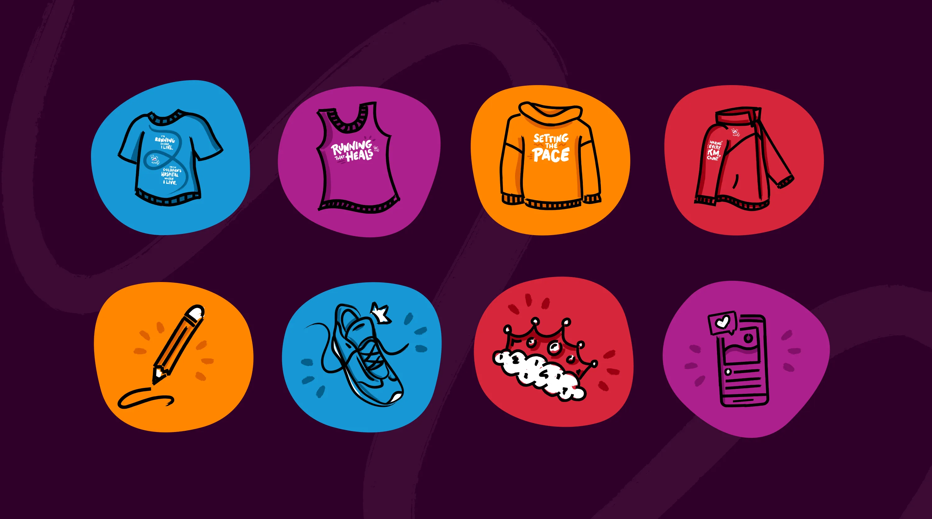
Illustration
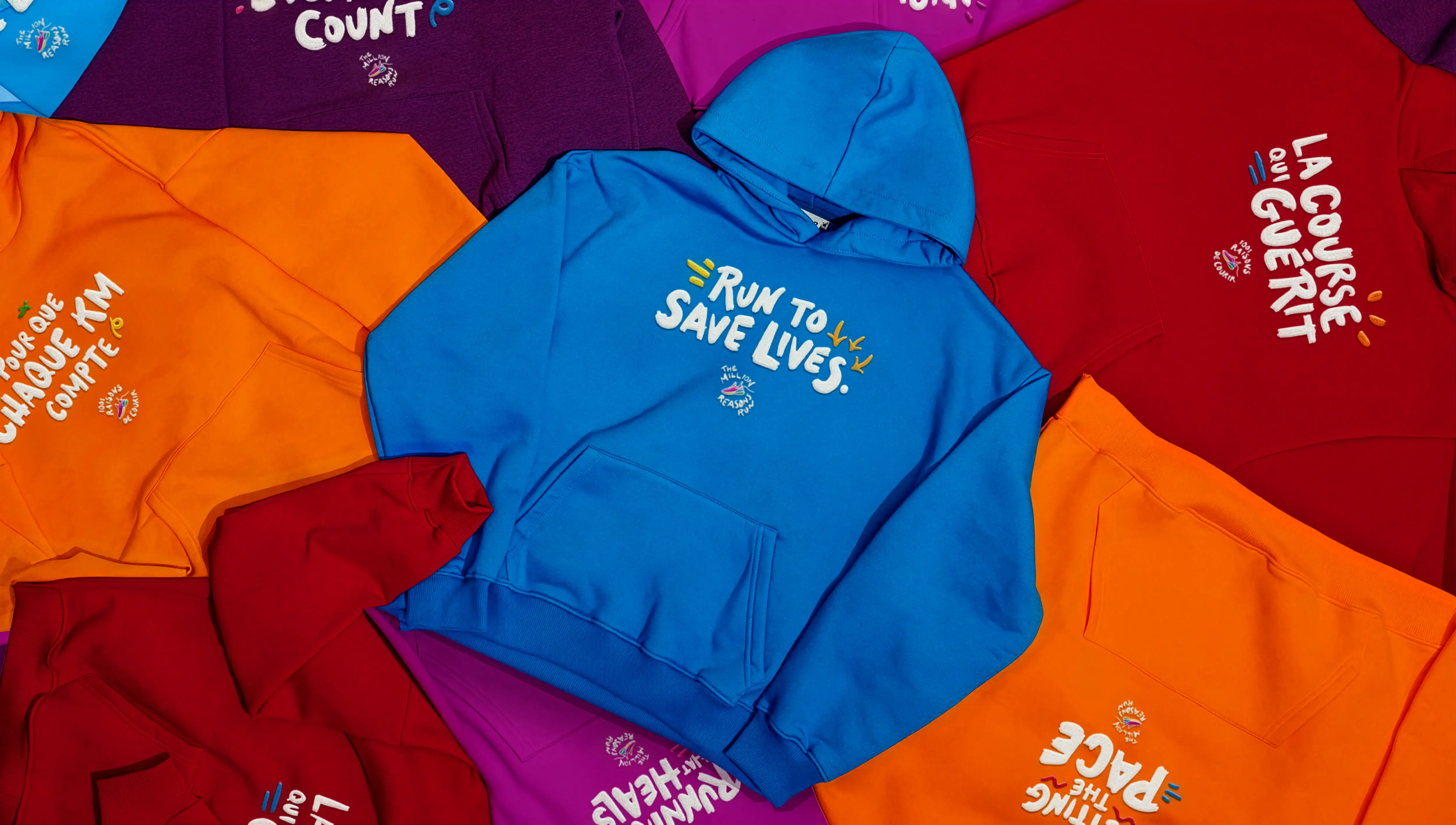
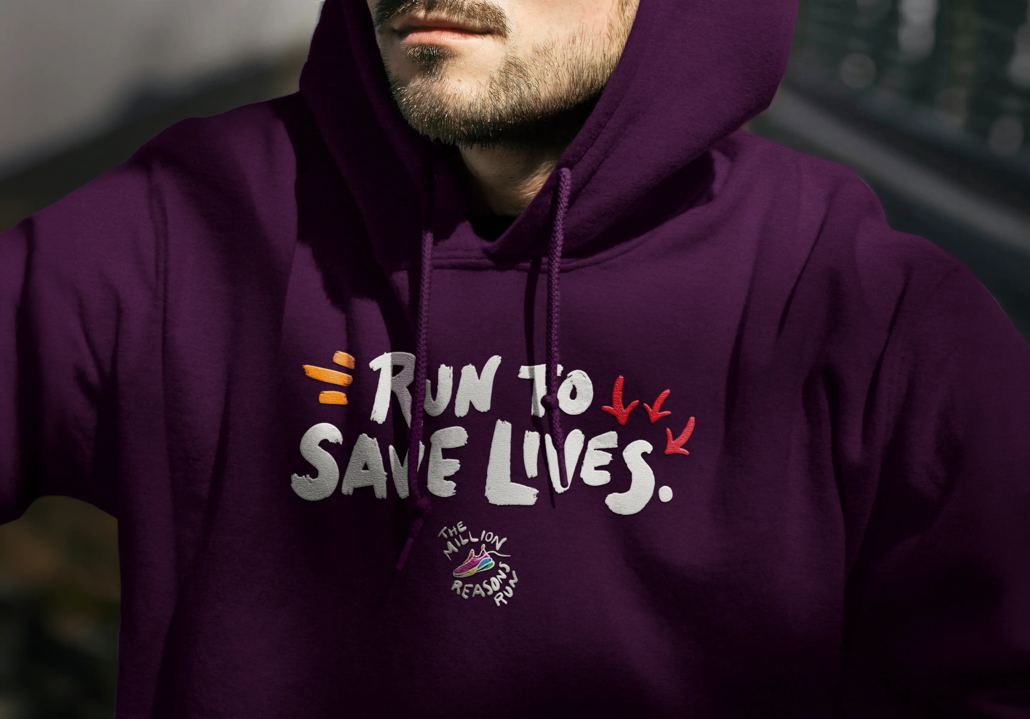
Custom illustrations and graphic elements were developed to anchor the identity across digital and print. The illustrations gave everything from social content to billboards and posters a recognizable thread that held the whole campaign together.
Custom illustrations and graphic elements were developed to anchor the identity across digital and print. The illustrations gave everything from social content to billboards and posters a recognizable thread that held the whole campaign together.
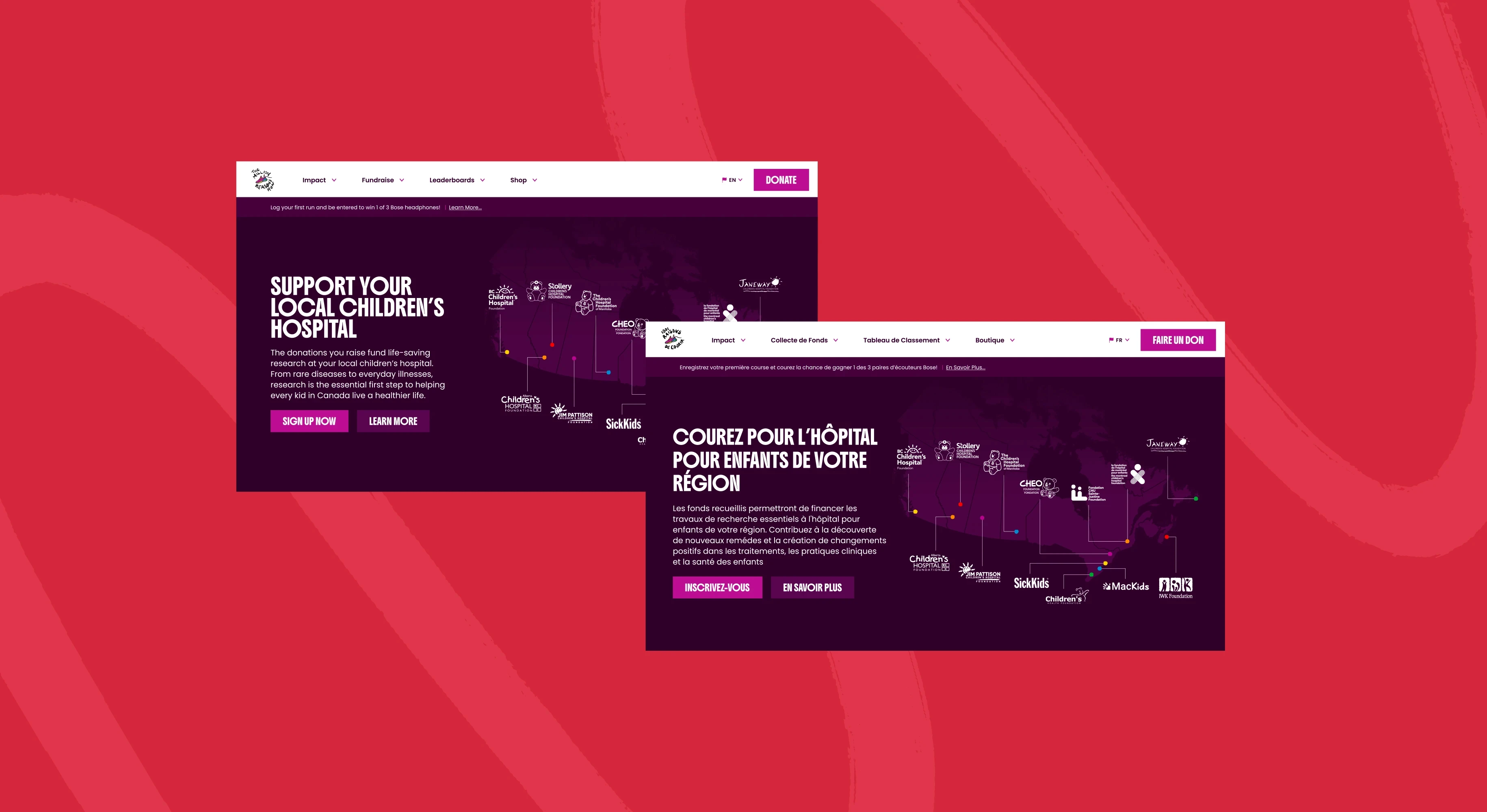
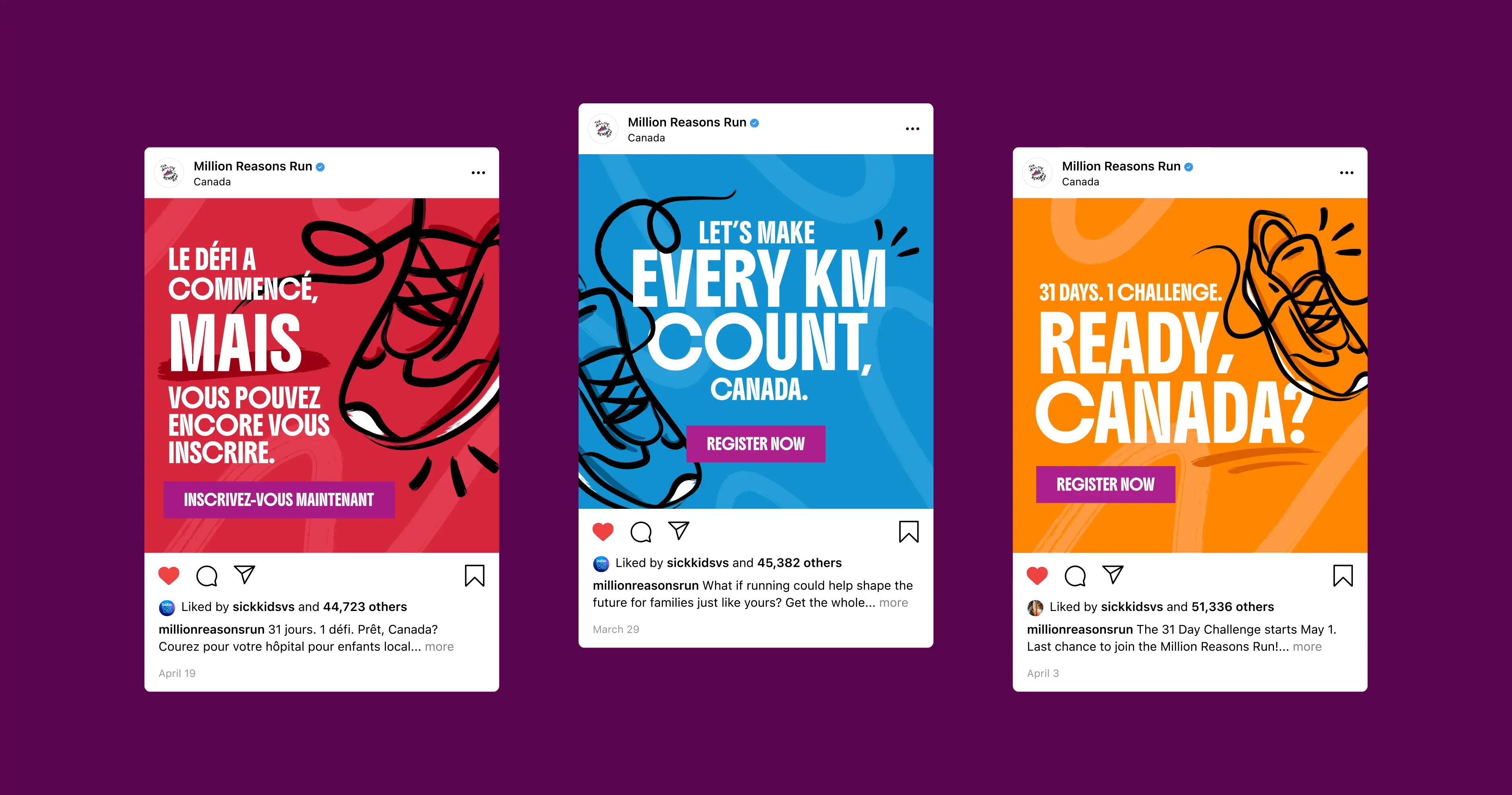
Localization
Every asset was adapted for French-speaking audiences in Quebec and customized for each participating foundation, managing bilingual layouts and regional variations across a high volume of material without losing consistency across the campaign.
Every asset was adapted for French-speaking audiences in Quebec and customized for each participating foundation, managing bilingual layouts and regional variations across a high volume of material without losing consistency across the campaign.
The Outcome
While the final campaign went in a different direction, this is the concept I'm most proud of. The process showed what was possible when the campaign was given room to evolve, and pushed me to think at a scale I hadn't designed for before.
While the final campaign went in a different direction, this is the concept I'm most proud of. The process showed what was possible when the campaign was given room to evolve, and pushed me to think at a scale I hadn't designed for before.