Million Reasons Run
Giving a national fundraising run the identity it needs to set the pace.
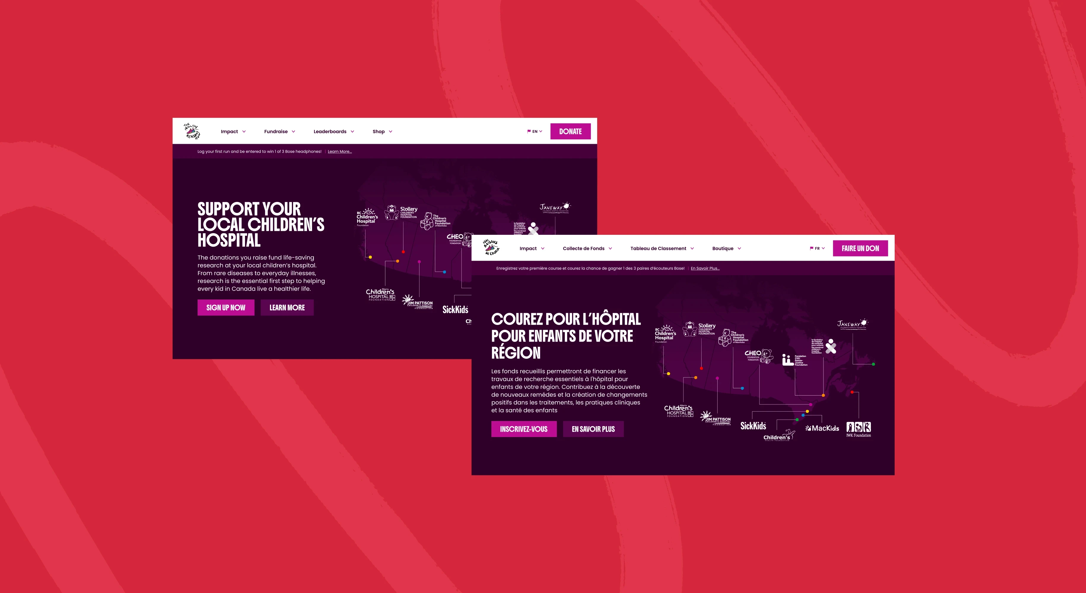
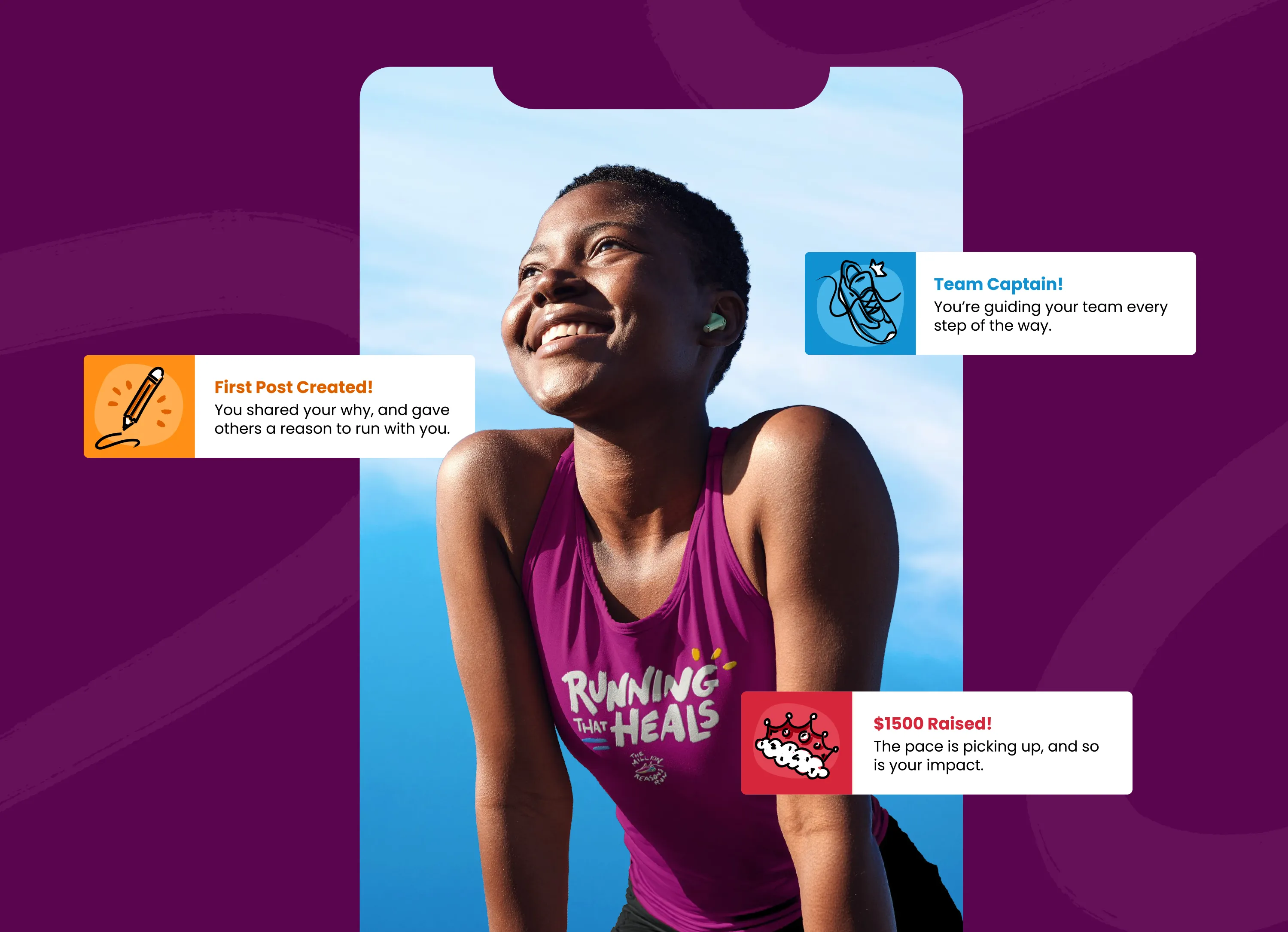
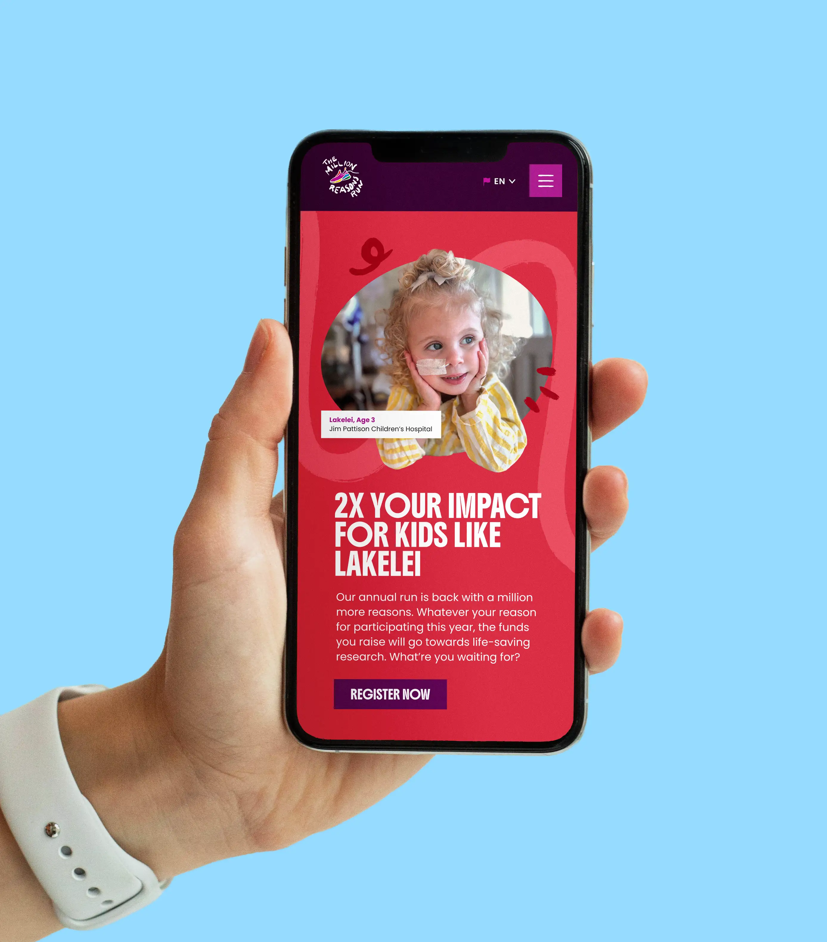
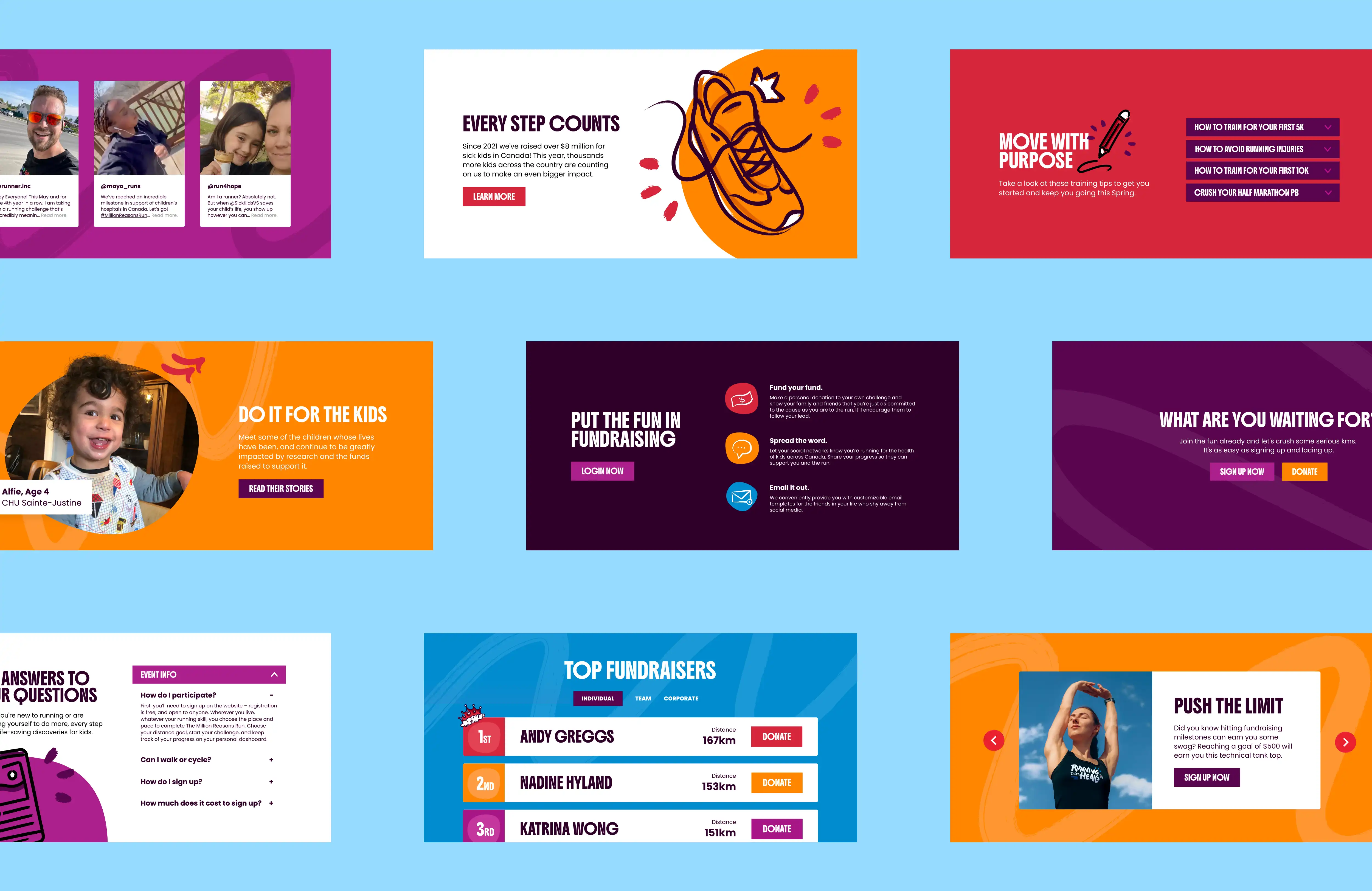
The existing website and marketing materials lacked consistency and did not fully reflect the organization’s approachable, youth-focused mission. The goal was to create a more engaging and accessible visual experience that could better connect with younger audiences while maintaining credibility within healthcare and educational spaces. As a freelance designer, I supported the refresh through website design, brand development, social content, and supporting marketing materials.
Year
Tag Here
Tools
Figma
Illustrator
Photoshop
Read More
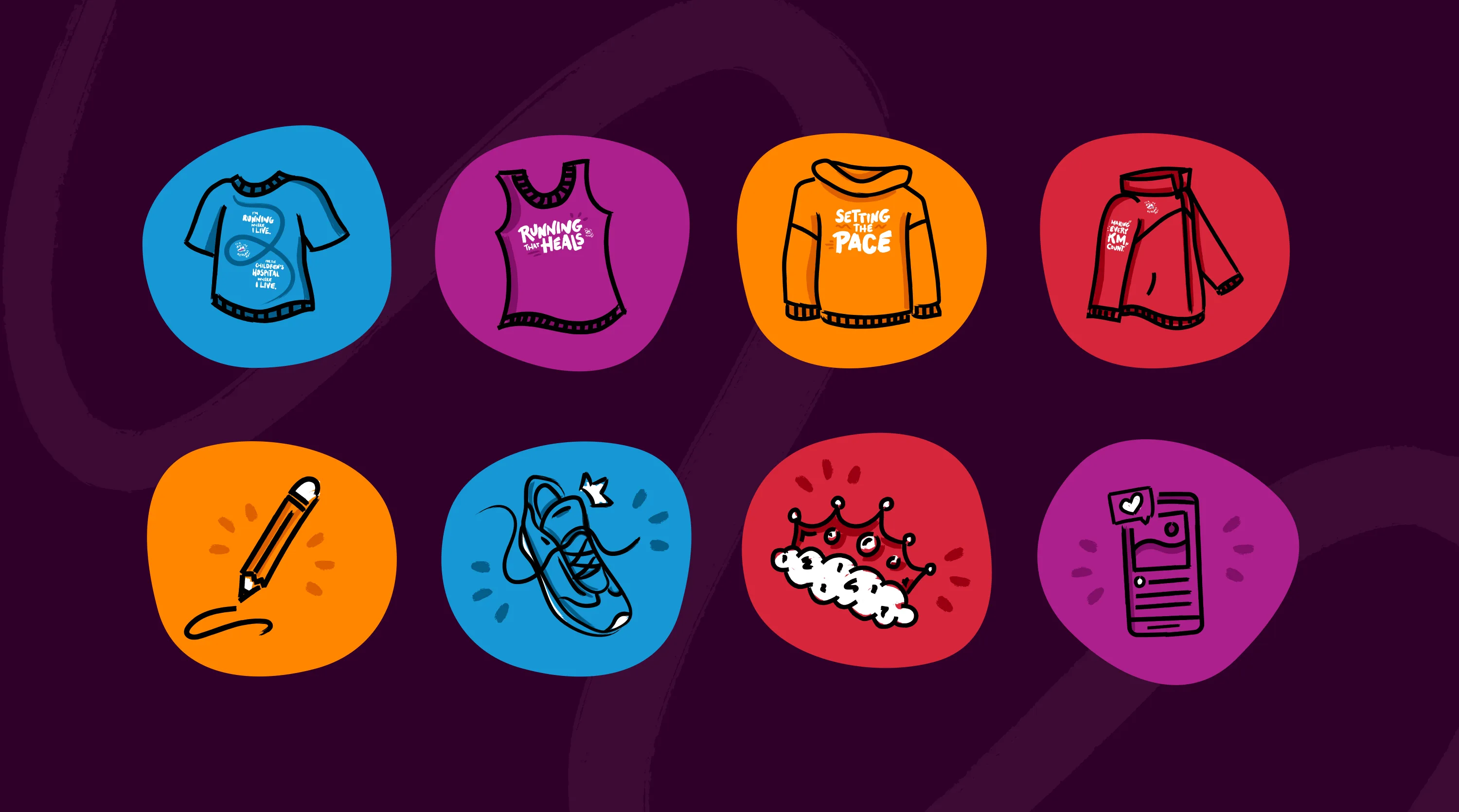
Illustration
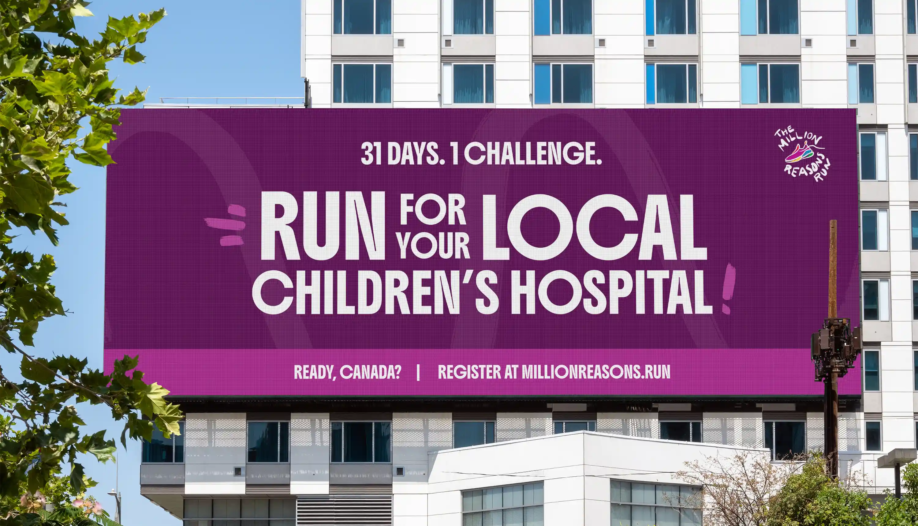
Digital & Web
Event
Services Provided:
Visual Identity
Brand Strategy
Research & Discovery
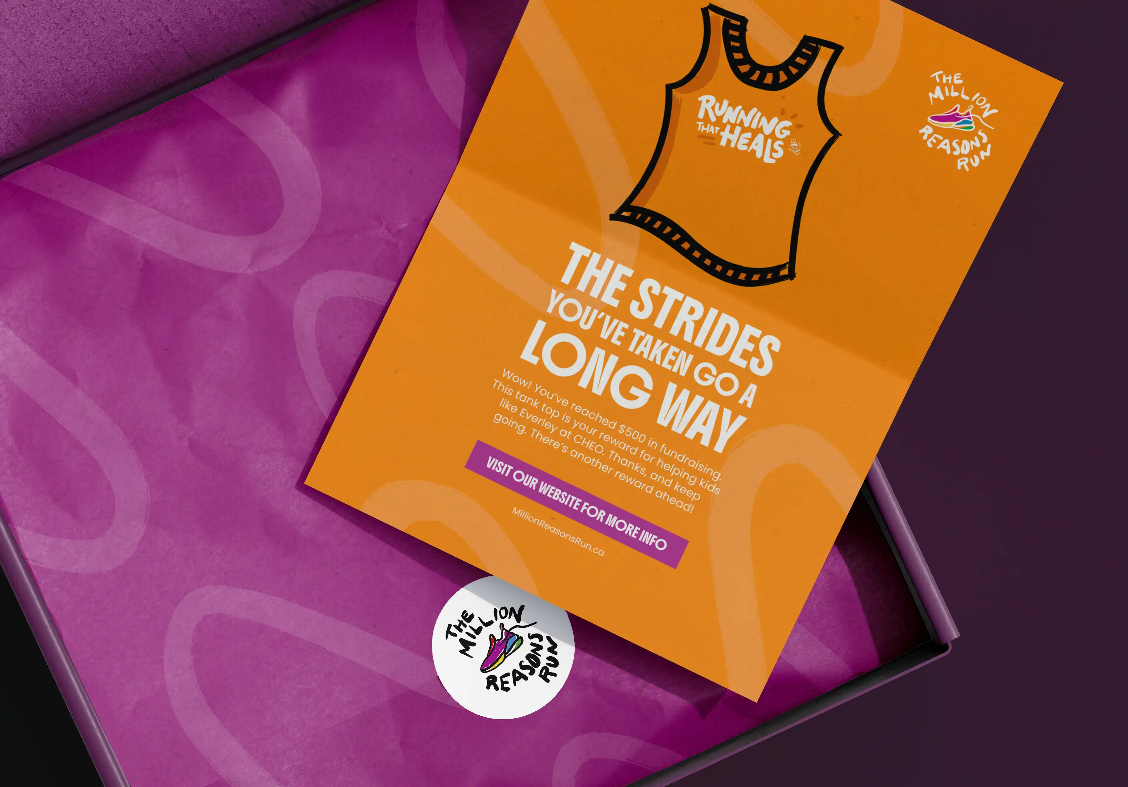
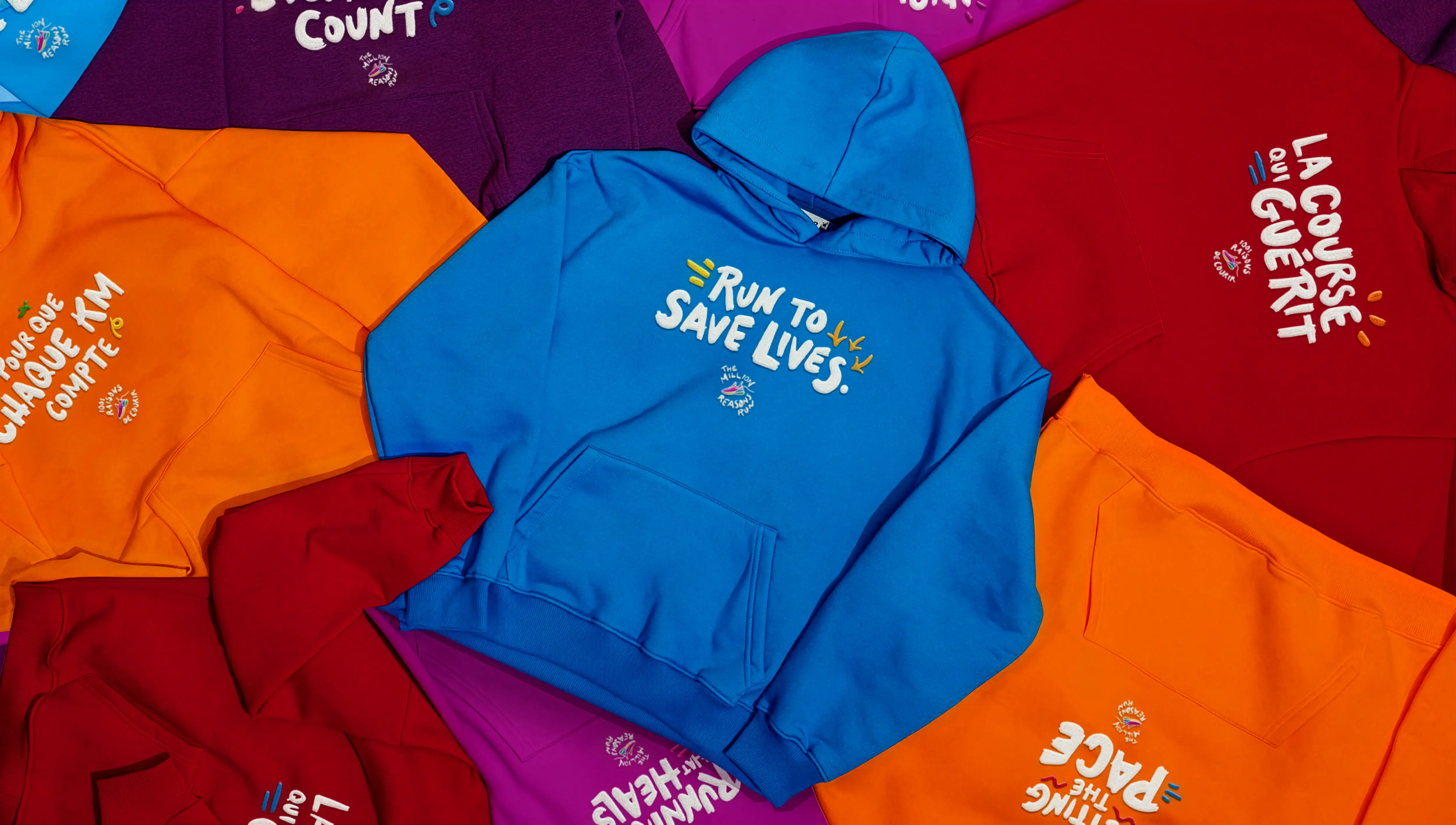
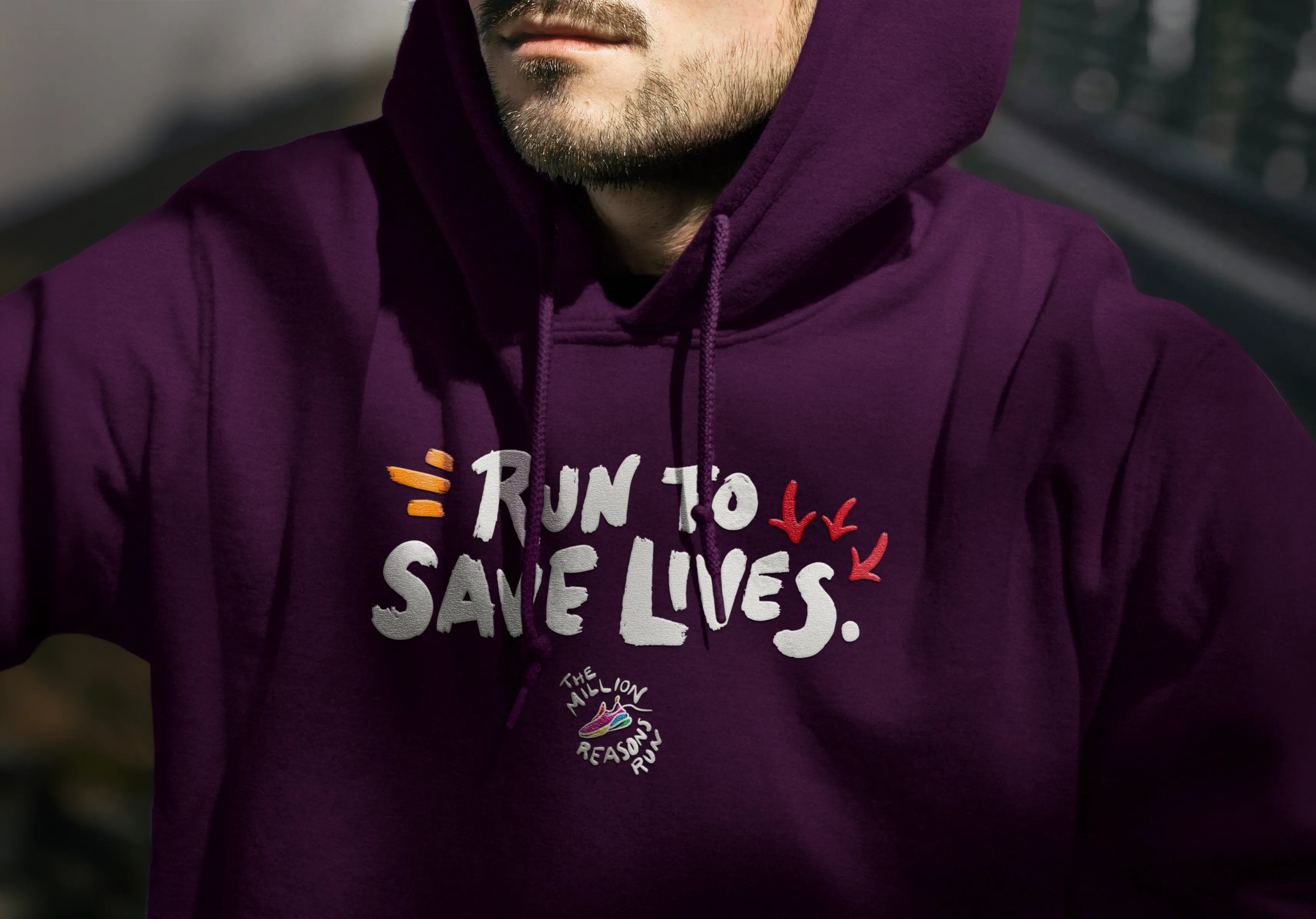
Illustration
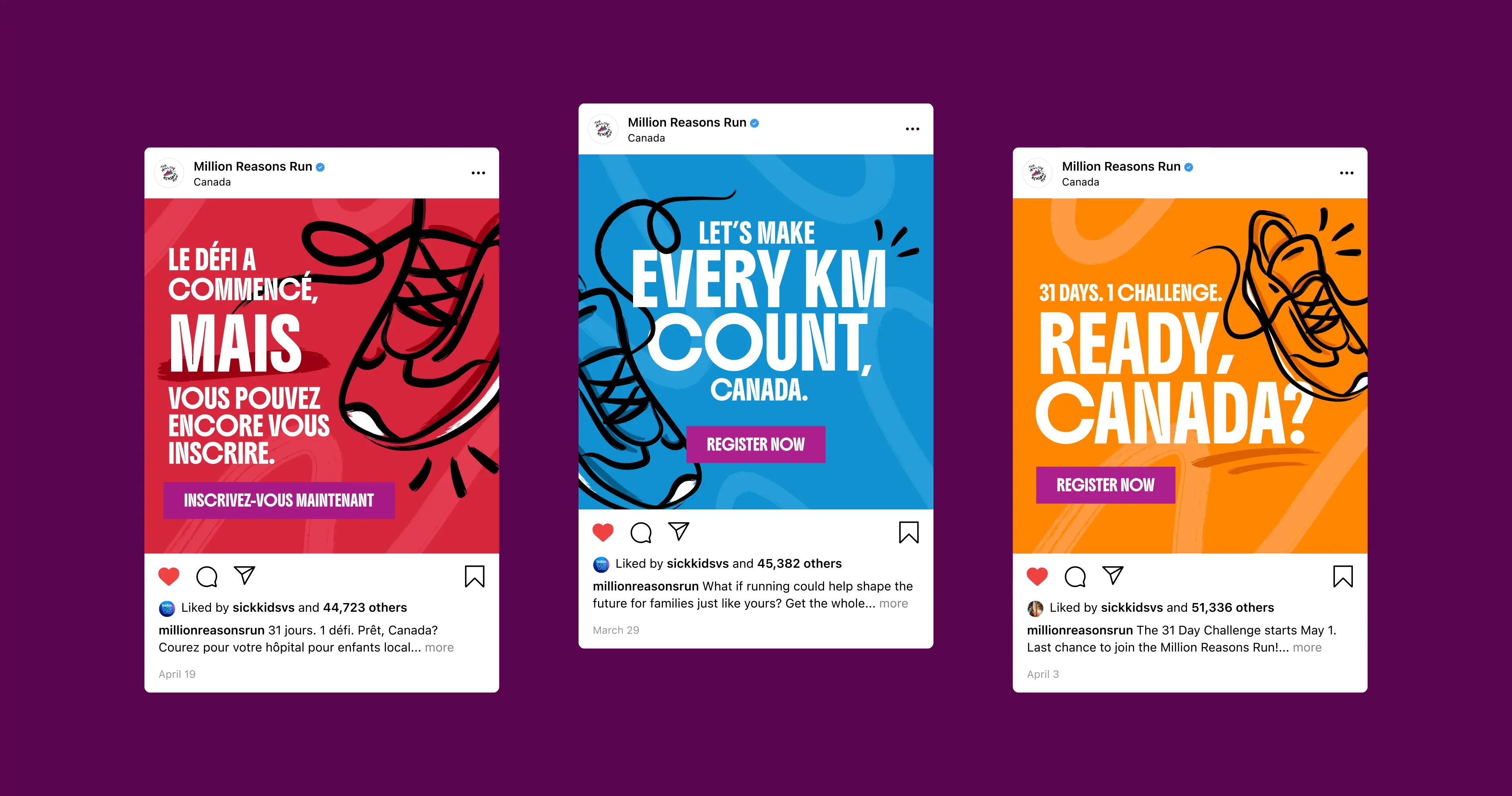
Marketing Collateral
Brand Refresh
How it was solved
Digital Assets
Illustration
Localization
The Outcome
While the final campaign went in a different direction, this is the concept I'm most proud of. The process showed what was possible when the campaign was given room to evolve, and pushed me to think at a scale I hadn't designed for before.